Friday, April 30, 2010

field and realizations

9x12 pastel/watercolor on marble dust
While I was preparing paintings for the show I found this one in my flat files. I am glad I didn't throw it away. It reminded me why I like a rough surface sometimes. This is marble dust and gesso on gator board, watercolor on top..then pastel.
I worked a little more on it and stopped.....it might be enough. How much do you need?
During this time of preparation I have come to a realization. Sometimes it's really good to examine all your work. More about the realization tomorrow.
Now I continue on my studio piece and more readiness.

Thursday, April 29, 2010

process and the robin family


12x12 oil on panel
I am posting process photos right now since I am balancing my time between show prep/ working on bigger paintings/ teaching / plein air and life. (Do I sound a little stressed? oops sorry))
This is the second layer of oil that was painted into a couch of linseed and OMS on top of the grisaille I posted yesterday. Before placing down the couch I had rubbed in a layer of paint (on the grisaille) to get an idea of color and value. As you might be able to tell- my goal was warm unity. Cooler areas will come on top later.  (restraint)
I actually make this plan last week and the grisaille was painted then. I am waiting till I can fully visualize the concept before laying in color. It all began with the plein air work from last week, but I have planned changes and it will not duplicate the plein air work. I like working with a couch. It  creates a slippery feel on the panel and the paints just glide.
Here is a photo of my palette. I am working for color harmony and pre-mixing all my color. It feels good to slow down and just enjoy mixing the color.
On another note...the robins are hatching. The Mama robin flies away the minute I come outside so I am trying to refrain from watching all the time and taking photos.
toodles till later!

Wednesday, April 28, 2010

grisaille for a new painting

12 x 12 oil on board- grisaille
After a number of small plein air pastel paintings of this scene I decided I was ready to begin a studio painting. On Saturday I made the detailed drawing for this, but after I transferred it to the board I decided to change it in order to create more distance.The board on which I paint has many thin layers of gesso, sanded between layers to make a super smooth surface. The paint was applied with brushes, a cloth, Q-tips and fingers, different tools for different effects.
 Yesterday was varnishing day. All the paintings now sit to dry in flat files. It helps to keep the cat hair off the paintings.

Tuesday, April 27, 2010

mysteries that are mine alone

6x6 oil on board
This one has haunted me. I couldn't quite get it. I let it dry completely sanded a little of it off (in the left side reflections), then I glazed more color over it. Now it seems to say what I wanted.
Did you ever think about how we as artists create something from nothing, inspired by something seen or felt? Making beauty and feeling. hmmm.
I have been thinking about the way a work of art is the manifestation of the person who created it. It it holds the spirit of that artist in the shapes and colors. I look at others' works in museums, galleries and online. I think about the person behind the work. That is probably why I enjoy reading artist's biographies. When someone looks at my work I wonder what they see. Have you ever thought about this?

"mysteries that are mine alone".... I think I remember that line from a poem I read long ago. Loved it, still do... wish I could remember where it was.

Monday, April 26, 2010

making light and use of value

 7x10 pastel and watercolor on mounted wallis
When creating light (especially with fog) I find it best to stay away from dark values, except for accents. Today the lake was covered in a misty fog, meaning values 5-10, high key. I was painting on top of an old painting so I used a lot of Chinese White mixed into the pigment. I tried to keep in a very limited value range (5-10), similar to how Sanford Gifford makes light.
How many times will I paint this lake? hmmmmm I think I will never tire of it as it is always different.

Sunday, April 25, 2010

buttercup season and absolutes

7x8 pastel and watercolor on Wallis
It's buttercup time, one of my favorite times.
I used some really intense colors in this painting, hopefully I  balanced them with enough  yummy neutrals.
Did you hear yellow comes forward and blue recedes? I decided to play with that, push that idea around. I dislike absolutes. It's about simultaneous contrast not rules.

Saturday, April 24, 2010

the more you draw, the more you see

12x 12 pencil on canson
 The land in this view  I would consider complex. So many layers of trees and rocks wind in and out from the water. My goal was to use a few lines as possible and limit any shading...thus making the space with line. I drew for about 3 hours. Beginning with a very light 2H and straight lines, gradually carving away at the land with selected lines and erasing. At the end I worked my way up to a 2B. It is amazing how drawing can be such a sensitive thing. Spending time drawing my chosen view really made me understand how the land is formed. The more you draw, the more you see. Now I will transfer the drawing to my panel and begin the grisaille.

Friday, April 23, 2010

glutton for punishment, again

10x10 pastel and watercolor on Twinrocker rose HP watercolor paper
I still have some watercolor paper to try. This one, Twinrocker/ hot press has a nicer texture.  The only problem is the buckling that happens after the watercolor is applied. I do tape it down with my usual black masking tape. But it doesn't seem to be enough.
Watercolorists out there...would you make solution suggestions?

Thursday, April 22, 2010

true love returns

about 7x7 pastel/watercolor on wallis
I returned to the river and added the pastel to the watercolor. Now I know why I missed sanded paper! I love the effect of watercolor and pastel. What was I thinking all this time???????

Wednesday, April 21, 2010

the river

 
7x7watercolor on wallis
This is a second painting from the pastel-less day. Tomorrow I will go back and add pastel. My concentration was on edge and not becoming defined in the watercolor. Leave the decisions for pastel. It's hard to undo a sharp edge. That also could be said for grisailles.
I was also very conscious about just using a few colors- alizarin crimson, paynes gray, green gold, ultramarine blue. At the end I added a speck of cerulean blue. I like the very transparent darks that watercolors have.

Tuesday, April 20, 2010

watercolor paper and goslings

6x6 watercolor on Cotman???
Today I returned to the river....but........ I forgot my pastels. How could I forget them you ask?? Yesterday I took them out of my backpack. I felt I should clean the box and replace the tiny pieces with bigger same color pieces. Long way of saying I left the box in my studio. I didn't notice till I was parked, so I dug around in my trunk. Low and behold there was a long discarded watercolor pad of inexpensive Cotman watercolor paper. Off I went.
Now the  goal was different I had to make the painting without my treasured pastels! Yipes! The painting gives me an idea for a bigger one. I did second in a slightly different place. I will post it tomorrow.
One side note: the goslings are out. The Canadian Geese parents crossed the path in front of me. Following them were 5 lemon headed goslings. The parents headed down the steep bank. The goslings stopped and squeaked. One parent came back and encouraged movement. Like tumbleweeds two rolled down the bank and then popped up, kept walking. Oooooooh I love my job!

Monday, April 19, 2010

thank you and watercolor paper

Thank you everyone for your input about the paintings (of mine) that you liked best. Most of it matched my gut reaction. A couple were surprises. A few interesting ideas came up, like Deborah's grouping thoughts. It was a fascinating process.  Most of all I really appreciate the time you had to take to really look, think and give your opinions. Thank you!!!
In return, I post for you a picture of the robin's nest in my rose bush. Beautiful eh?
Thank you: PB (Doug), Sam, Kaylyn, Astrid, Janelle, Caroline, Leah, Deborah, NJ, Leah, Lisa, Jala, Carolyn, Donna, Jim, and Agne. (includes comments and emails) Thank you also to Kaylyn who emailed me a nifty graph of the choices.... impressive!  Please come to the show if you are in the vicinity. I will be doing a demo on Saturday (May 15) at 4:30. Yipes!
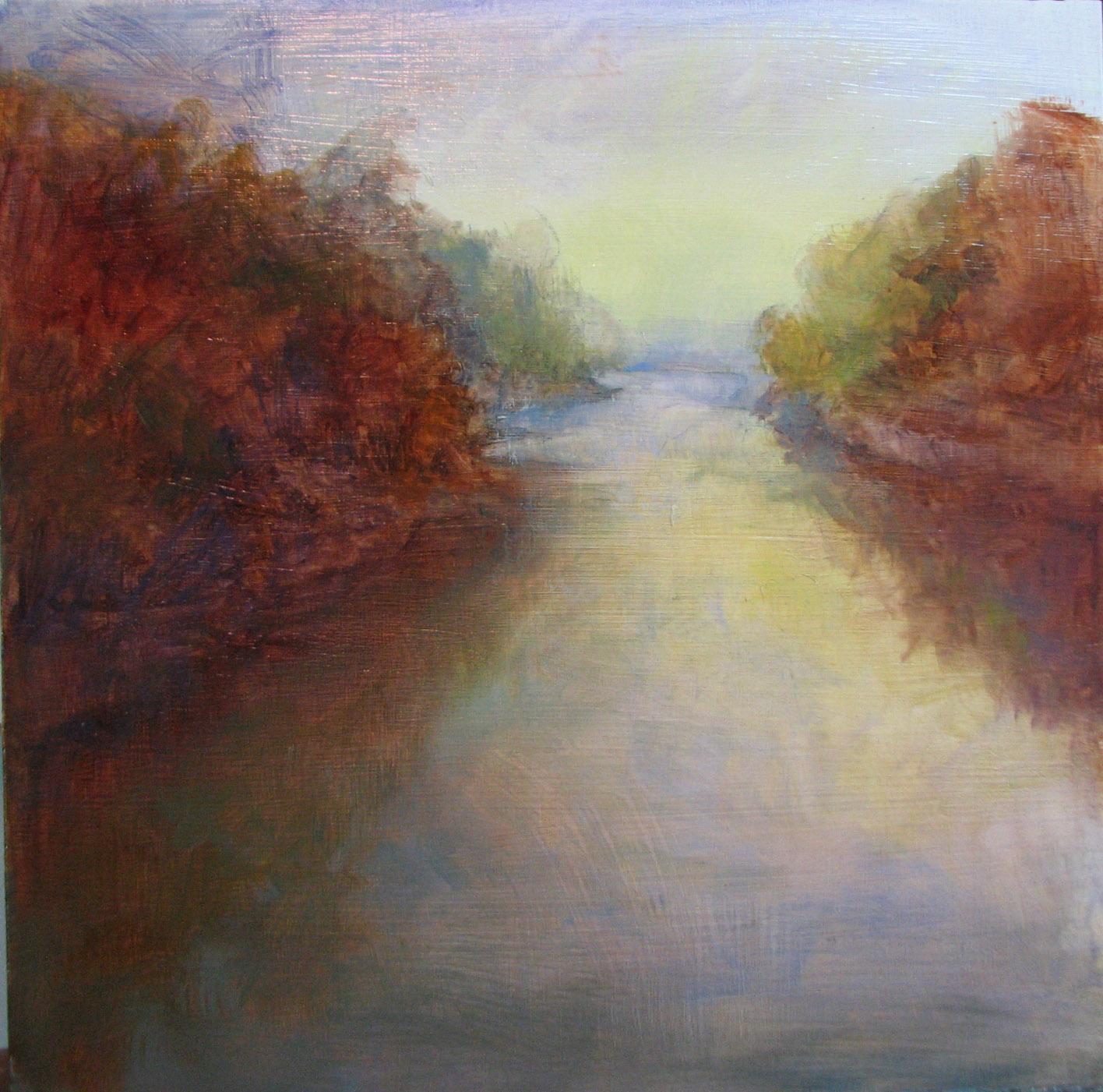
I would also like to thank PB, otherwise known as Doug Daniels. He was aware of my explorations with papers and generously mailed me some samples from his stash. The square painting above was one done on a piece of Fabriano. I found that real watercolor paper DRINKS paint and the surface, even hot press, is bumpy. While I enjoyed some aspects I realized sanded pastel paper is not that bad. Today I returned to UArt (again) just to enjoy what I KNOW. Thanks Doug! If you haven't met him already check out his watercolor blog.
Since 80% of my paintings in the show are pastel I have them framed, rather than do it myself. I am an impatient framer and pastels are challenging to frame. It feels good to have that work shipped off to be framed. Cross that big job off my list.

Thank you again blogger friends!

Sunday, April 18, 2010

possible paintings for show

 37
 38
 39
I have weaned down about 60 possible paintings to 39 paintings. From these 28-30 will be chosen. Place your input in the comments section. The theme of the show is the transition times- dawn, early morning dusk, and fog. The times when light does not stay still instead performs its magical dance. Some of the paintings are big (3ftx3ft) and some are tiny (6"x6".) You may tell me your favorites, or the ones you think should be eliminated. Place your input in the comments section. Thanks!!!!!