Sunday, October 31, 2010

Autumn, a season of delight for the colorists

about 9x10 pastel on twinrocker

Autumn, a season made for those of us with colorist tendencies. It's very hard to stay in the studio with all that goodness outside. So, why resist?
While out in the field I had an urge to break a rule. I placed the tree in my painting - dead center. To counter that I put my focal point in the bottom third- the grasses that meet the right corner of the tree. Could it work? hmmmmm.
It was funny, that while working on it, it made no sense. I worked very abstractly in only large blocks of color. I painted with the local color only at the very end.
I thought you would find it interesting to see a photo of the place I painted. Now you can see all the decisions that have to be made while painting. The two main alterations were: value change for the distant trees and chroma changes for the foreground.

Saturday, October 30, 2010

finding glazes my way

8x10 oil on linen
My chant was..."It's just pigment. It's  a little wet, but it's just pigment. Treat it like a pastel, no different. It's just pigment"
I am freeing myself from the tyranny of doing what I know I should do in order to glaze. I think I was getting uptight. I really appreciate all the learning I did (thank you Deborah and Kay), now I am going to try to answer to me. I am trying to live my my old motto I had when I worked exclusively in pastel, "What happens if I .........?" It brought back the excitement I had been missing with my more calculated glazes.
Sorry for the glare on the painting.... I was just excited to post it:-) And even more excited to begin the next one!

Friday, October 29, 2010

before sunset


7x9 watercolor and pastel on Uart
Late afternoon, as the sun sets, the air has so much warmth in color.  That means choosing color to lean warm even when it seems cool. More pink when it seems violet, more violet when it seems blue...pick the warmer version. As the light slipped through this small slice in the forest (a power line cut) it provided deep shadow and small areas kissed with light.
The underpainting (above) was glazed with orange after the underlying colors were placed..

Thursday, October 28, 2010

sunrise

5x7 pastel on somerset
Rising from my very comfortable bed is much easier when I am going to paint. This was created in the moments before the sun would slide over the horizon and begin the day. The ground is cool and dark, yet the light rising from the place the sun will show momentarily is great. I think I will take it to the studio for a tiny bit of work.

Wednesday, October 27, 2010

more work with "removed grisailles"

about 11x11 pastel on somerset
I decided to continue the challenge. With value only I tried to create the feeling of the sun sinking below the horizon. To do this I focused on keeping the land masses dark, trying only to give light to the few places the sun's last light would touch. Making clouds with value only was the trickiest part! This will help me with the painting I began last week. My soccer field.
I wanted to share with you that my painting, Sunshine on my Shoulder, took 3rd place in the Maryland Pastel Society's show. I just found out about this happy moment!

Tuesday, October 26, 2010

moving the grisaille to a new place

11x14 pastel on somerset
Rather than paint a traditional grisaille on the canvas I am working the values on paper and then transferring the concept of the value to color on my painting. This idea comes from my plein air nocturne done last night.When I was working with Kay this weekend she was so helpful in reinforcing that I already knew. In the workshop she had us do value studies (something I LOVE to do)- This is mine.
Rather than paint a grisaille on my canvas I will use my grisaille  as my reference- A REMOVED GRISAILLE.  She talked to me about painting with my oils exactly as I paint so naturally with my pastels. I mix colors of pastels on the paper- why not mix my paints on the canvas?  She showed a really interesting video about Wolf Kahn that videoed him doing exactly that. It was like a huge "ah ha" moment. Why am I constantly fighting who I am????? Remember I talked about giving permission? Well this is about giving permission to be authentic. There is not a meticulous bone in my body..I am exhaustingly energetic (as my husband and friends will confirm) I prefer large movements to small motions...Why on earth have I been holding back? Kay suggested to go much bigger canvases and bigger 1 , 2 and 3 inch brushes so that I can move.
So that is where I am now.
Toodles for now:-)

Monday, October 25, 2010

nocturne-pastel, plein air night tips

pastel on very thick twinrocker paper-a warm tone..maybe sand
With my mini reading light in hand and the evening weather delightful, I decided to work plein air. Not being able to see made my decisions quick and small. I think this pastel took 15 minutes. It's about 9x9 inches.
Four tips:
* Keep your pastels in order so when you can't see you know where they are (no wolves in sheep's clothing!)
* The darks are very dark, but more interesting if they have color, not black.
*When choosing darks you choose from a family. A nocturne is often blue...or violet.  They are typically cool, but I have seen warm ones that are beautiful. (Rules are meant to be broken)
*The differences you make in the land are more about temperature shifts not value. This will be more evident in the oil I have been working on, using this as a study.
I am using rag paper and no watercolor... it's faster and more immediate. I have found that if I rub the pastel in deep I can layer a lot. It also allows me to be bolder with my mark...calm sections and sections with exciting calligraphy.

Sunday, October 24, 2010

full moon setting in lemon light

Early this morning I was up and out before the sun. I stood ready before the pond, eager to see the show. The sun rose behind me wrapped in clouds and below the trees. The amazing part was that the full moon set in front of me. It allowed occasional glimpses at its beauty.
Lately it has become obvious how the autumn light is changing its veil. A lighter lemon color is present...November is around the bend.

Saturday, October 23, 2010

halo of light, plein air pastel

pastel on somerset paper, about 7x10
This is another pastel that I did last night. The sun was getting low and hot air balloons were streaming by me. Could I ask for more? Nope.
Before beginning this painting, the main question I asked myself was, What about this scene affected me most? The answer: It was the way the very dark shadow and its refection  played off that light halo of pink and gold behind it. That GLOW. I also liked the  way the trees went light to dark in the main mass.
To keep to my main idea,  I would make a mark and ask...did that help or take away? Every 10 minutes or so I took a photo of my painting. That may help me later. We will see.
Check out Kay's work here.
And I will go to class. tata.....

Friday, October 22, 2010

back to pastels- sunset

Ok, so I am back to plein air painting. Like an addiction, I can't stop. It's funny I have this little devil on my shoulder that tells me I have to do large oils. I guess when I figure out how to get what I want from the oils,  I will feel the same amazement and enjoyment. Alas....not now;-)
So today I was in a workshop with M.Katherine Hurley. I took this workshop because I have always loved Kay's work, both her oils and  her pastels. I thought I could glean some insights as to how to use the oils to create the look I see in my head. So, today, the first day,  I used pastels...go figure.
Below is the pastel I did during the class. Above is the one I did this evening quietly on the hillside, alone.
Long ago, Kay studied with Wolf Kahn for many years. She teaches with many of his methods. The most fascinating to me is "the jeweled ring." I will talk about that in another post...first I need to process....and sleep. Meanwhile, check out Kay's website.

Thursday, October 21, 2010

tree studies and quality of line

                                                 
 Like a person, each tree has a distinct personality. I think we show that personality through our use of line, its quality. Varying the line between thick and thin can imply many different things, two of which are space and light.   For instance, I  chose a much darker line, at the base, where I wanted the tree grounded and coming forward. I made it lighter where the sunlight struck the edge. In addition I used  the white of the paper to imply more space. It allowed the tree to "grow." The other trees in the background fade back with weaker lines. It provides  a slight indication of space -but not too much, I kept it intimate.

Wednesday, October 20, 2010

choosing color to convey mood:painting and cooking

10x10 oil on linen (probably unfinished)
How can color be used effectively to convey mood in a painting? Think about the emotions you want to express and then decide which colors do it. (It really is ALL up to you.) This painting was done from a study I made after my visit to the Ding Darling Refuge in Florida. The study was a memory piece done 5 days after I was there. It is vibrant and intense (see below, pastel.) I took that idea and created a one color underpainting, with small changes in composition. I chose to make a quiet, early autumn painting (very different from the saturated intensity of Florida). Aiming for a more Tonalist, restrainted feel, I restricted my palette. I have no photos, it simply comes from my feel of autumn. One of the biggest problem folks have is relying on their photographs. Yes, I know the top small oil is not as effective as the bottom pastel. But for better or worse both came from inside of me. I still feel my biggest struggle is to get the oils to do what I know I want. Again it's like cooking. I am still working on my rosemary walnut biscotti recipe. Each try I get a little closer to the taste I want. Patience is my key word. I know I need to simply keep asking myself...what will happen if I try this...or this and soon I will figure out how to get the effect I desire.... it's a quest. Painting and cooking...both  are quests of a sort. Enjoy the hunt, the struggle and the elusive, fruitful, discovery.
7x9 pastel on paper

Tuesday, October 19, 2010

new underpainting

Two versions, same painting... I wiped this underpainting off a million times- one right after another, all day yesterday. I couldn't stop myself. I didn't want brush strokes so I relied on a tissue rather than a brush. It needed small areas of value change in the tree mass and sometimes it was too much and sometimes not enough.
I am a nut case. I see what I want and can't get it! Below you see the "inspector" informing me this one needs work.
Corot  painted  the soft, gentle light of France.
Did you know? His hazy landscapes with misty grays veiling nature's color, an effect achieved by overpainting while his underpainting was still wet.

Monday, October 18, 2010

back to basics with Corot


Seems like I just need to go back to the basic drawing- find the grace and eloquence in trees.

                I leave with you words of wisdom from Corot's sketchbook:

While I’m seeking conscientious imitation, I do not for one minute lose the emotion that overtook me. Reality is part of art; emotion completes it. If we were really touched, the sincerity of emotion will pass unto others.”

Another nugget of gold from one of Corot's pocket sketchbooks:
 “One would be wrong to get discouraged after two or three mediocre studies. It is the preparation of the good one that profits, without us noticing so, from this seemingly sterile work.”

And just one more:

In the artistic career, one needs conscience, self-confidence and perseverance. Thus armed, the two most important things in my eyes are the strict study of drawing and that of color values. "

Sunday, October 17, 2010

limited palette, Andrew Wyeth and vitamins

9x12 oil on linen
Andrew Wyeth had a habit, a wonderful habit, he painted every morning for 50 years. "I'm like a prostitute," he once said, "I'm always on duty."I definitely understand this idea of being on duty since I don't feel "right" unless I have had my vitamin.
This is a studio work done from my many plein air studies in this field (see paintings below.) I kept a limited palette- 4 colors and white- garnet red, viridian, ultramarine blue, and indian yellow. All 4 colors are transparent.
Andrew Wyeth was once asked,"What makes painting a good work of art?"   He replied, "Some artist think every work they do is a work of art, I say keep working and you may produce a work of art" I will keep working.
I toast this man...he was the king of vitamins.


Saturday, October 16, 2010

analyze your work and Maryland Pastel Society Show

Here are the two paintings of mine that will hang in the Maryland Pastel Society Show (October17-November 7.)

After analyzing both I have listed their reasons for success:
1. they each have a dominant value
2. dominant color (top- orange, bottom-golden yellow)
3.dominant temperature
4.strong focal point with two other "lead around" points
5.edges  vary-hard/soft
6.exciting mark making with quiet spots
7.shapes-interesting with variance 

One interesting fact for me the top field painting has a center of interest that is in the foreground...very unusual for me...but I was obsessed with that field. It's a plein air painting. The bottom painting is a studio pastel completed from many small studies.

Analyze your own work at least once a month.... See your patterns, good and bad.

Friday, October 15, 2010

Potomac River Jam

about 6x11 pastel and watercolor on Uart
This weekend is the Potomac River Jam and I will be exhibiting a selection of my river paintings. This is one that I created at the Mountain Maryland Plein Air event, yet I was never really satisfied with it. I kept it on the wall at home and had to walk by it at least 12 times a day. Finally, yesterday, it screamed out to me..."this is what you need to do." I listened. Now it's finished. Yay!!!!

Thursday, October 14, 2010

fog, focal point, and subordinate areas

 
Fog..oh fog is a wonderful thing to paint....why you ask? Fog makes you focus on one thing then it quickly dissolves all that is not important. You need to select an area that excites you then employ all your tricks. Possibilities include: your strongest change of value, the sharpest edges, most interesting color. In this painting I chose to use only neutralized color, but through use of complements, I hoped to create a vibration.

Wednesday, October 13, 2010

3 year old blog gets a new name and needs your help


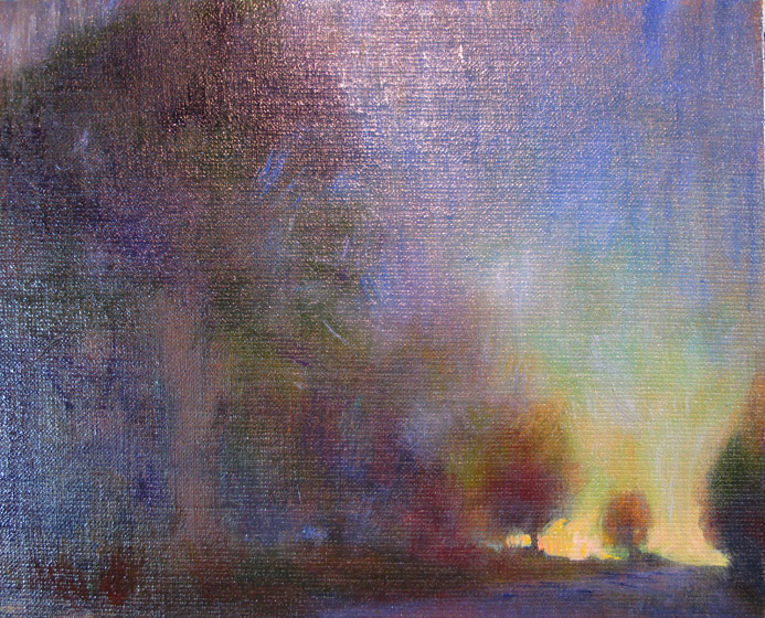
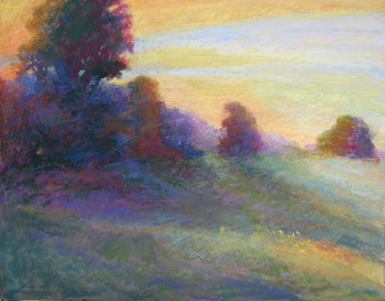
top,-pastel 8x10 Uart, bottom -oil on linen
At the top is another plein air study of the field at sunset. I am trying to make the "burnout" that happens when the light is SOOOO bright.  When light is intensely bright it will burn out the darks nearby, note the lemon yellow as it touches the trees. 
Underneath is the underpainting for the next oil that will be based on these studies.  I am going to TRY to hold back on color and only use 2 or 3 choices with some variance (temperature and chroma). Let value make the statement. So far I used transparent red oxide and shale to create the underpainting.  Hmmm, that's two, already.


In case you haven't guessed already, I am still blogging everyday. I will have to rename the blog since it won't be a new painting each day. Instead it will be plein air paintings, small nuggets of information, paintings in process, finished work and occasional interviews. Does that sound good? The question is what should the new baby blog's  name be?

1. Painting Everyday- A three year old blog moves forward
2. Painting Each Day "Old enough to walk but young enough to fly."(Sam's quote -Sam of Samartdog)
3. Painting, Life Goes On

Please send your ideas!


PS I may take some weekends off from blogging..we will see.

Tuesday, October 12, 2010

sunset on the field

8x10 pastel on Uart
Last night I went out to my soccer field to attempt a plein air painting of the quickly setting sun. The time one has to work is so small, about 10 minutes and then there are BIG changes. I set up an underpainting of transparent brown oxide oil before "the show" began. When the sun finally set to the place where it lit the tree edges, the race began. I must admit that keeping my pastels in the same place helped since the light in my eyes was blinding. I could not see the pastels or the paper with any reliability. I would reach for a pastel and hope it was correct. (pastelist, keep your box in order!)  I am working with this in the studio now and I think I will return to the field again tonight.

Monday, October 11, 2010

back to reduction and essentials

5x8 pastel and watercolor on wallis
Back to the idea of what is essential?
I am so guilty of looking at a scene and being totally taken with its beauty that I paint with the abundance of colors I actually see. My goal is to reduce those colors down to the most important to allow the viewer to feel the sensation.
The canal had a light fog of a neutral violet and the light was golden. The color I chose had to stay in those two families. I made the sharpest contrast in the focal point. When you look at the photo you might not know it was the same place. hmmm.

Sunday, October 10, 2010

long morning shadows

8x10 pastel and watercolor on marble dust
Using a piece of rough gator board with marble dust/gesso mixture set a whole different tone for a painting about light. After weeks of smooth surfaces and glazing I decided to "shake it up." I used transparent watercolor with lots of mark action on top in the shadow grass and more opaque thick color in the light. I wanted big shapes...with interest. Checking your work in the b&w mode is a good way to see how successful/unsuccessful you were.

It has possibilities for further work.

Saturday, October 9, 2010

accessorizing the sky

8x8 pastel on wallis
When you get dressed to go out you normally choose one piece of clothing and everything else is picked to match/work with that piece. When painting a landscape that piece is the sky. The sky sets the tone and the color harmony.
Intentionally I chose the exact same spot from which to paint. Constantly I kept thinking.. "the sky." Often an oil painter will put a little bit of the "mother color" in each color to keep harmony. Glazing is another way to create a mother color.  Pastels are different. The mother color is visually  understood, but isn't physically added.
Another note, painting plein air really invigorates  me! ..But you knew that.

Friday, October 8, 2010

plein air orchard dare

7x9 pastel on wallis
So wonderful to get back outside! I dared myself to place my focal point-star tree in the middle. Concentrated on choosing only a handful of pastel and using ONLY those.

Thursday, October 7, 2010

nocturne

8x8 oil 
I am having a very hard time photographing this nocturne. When it dries I will try again. What you can't see is the very small changes in color temperature across the land. The value is the same, but (when you can see it ) you can read the structure of the land. The color temperature defines the form.

Wednesday, October 6, 2010

drive with a map, paint with a plan

After completing notans and movement drawings (see yesterday's post) the composition was decided. Now it is time to create a color plan. Without a plan you are driving without a map. Yes, we all sometimes drive w/o a map and it can be fun; but when you really want to get somewhere you take out a map.  So I consult my handy analogous color wheel.  With this particular painting I am choosing the two analogous colors: yellow and green. The complement is a reddish purple. The two discords will be used in very tiny bits, evenly. A strong painting must have a dominant color. Mine will be the golden yellow that was created as the sun crept over the trees.
The underpainting was done was close complements. It continues to grow...slowly as glazes do. The pinks keep glazing more violet. I will try to edge them more neutral.

You may buy your own analogous color wheel from Dakota- here.

Tuesday, October 5, 2010

making a composition

Believe it or not this painting began as my soccer/basketball field. You may seem some similarities. The idea came to me when I was on the field observing a nocturne. Darkness makes the important shapes come forward. Like a sculptor I gradually carved away at the landscape to create something pleasing. A reflective surface and distance weaving back were fabricated to make a composition with interesting values.
The focal point is in the bottom right point, according to the rule of thirds. The rule of thirds is a compositional tool which shows you the sweet spots. Each time the lines intersect there is a good place for your focal point.
 Here is a tiny drawing that shows my notan and compositional lines. The lines show where the movement happens in the painting.


Later, while reading Composition and Perspective I noticed the similarities in composition to Constable's famous The Cornfield.  Not that I am saying my small painting in anyway resembles the greatness of Constable..just that there are compositional similarities. I read that Constable regarded this painting as one for his best researched works. He made studies of every detail before building it into a satisfying composition. The parts did not appear in nature in the same positions as they do in the painting. He did what all painters do, he moved things.
So painters, feel the power! Just because you see it that way doesn't mean that you paint it that way.

Monday, October 4, 2010

experiments with the colors and details of underpaintings


It's funny to me that I am trying hard to get away from description and only paint the essence yet I am creating precise underpaintings. Seems counter productive, eh? You create to take away. I gradually etch away at the underpainting by creating a haze of air and losing more of the precision each time with each layer. That being said, I am experimenting with how much detail is needed to begin with and  how much  to leave. I also am working with the underpainting color. Note on the paintings above:
top: burnt sienna, transparent yellow oxide, and shale-early morning, early autumn, field Olney
middle:shale, slight addition of burnt sienna- nocturne, cooler, darker, tree Whidbey with path
bottom: all burnt sienna-dusk, distance warm, dark mass in front, next door field
I keep the notes so that I can remember. Since I am now working on up to 6 paintings at a time, it's easy to become confused.
Today is the day..my blog is 3 years old.