Monday, February 28, 2011

painting with intent, knowing your tools

7x14 pastel on thick somerset
Since painting at the easel is a challenge right now I have been enjoying value studies. In the past, I have been guilty of relying on color to create a painting.  Gradually I am changing that habit.

In this painting I want the idea of solitude, yet the challenge of adding an animal, something I rarely do.  Suggestive is the quality I desire, rather than a tabloid "tell all." After deciding those two things the next question was, "which is the best format to reach my goal?" In my sketchbook, I reduced the landscape to basic shapes, like a notan, but a little different. I like to use pastel for this, with pencil I get caught up in those details that just don't matter. After 8 tries I decided on the 1 to 2 exaggerated horizontal.

Having a concept is very important. Realizing and using all the tools you have to make that concept work is the way to make your art more intentional.

I think I will go play with the other possibilities now.

Sunday, February 27, 2011

value study of waves and seascapes of Tryon's

7x10 pastel on paper
A couple of years ago there was a memorable exhibit of Dwight William Tryon's seascapes at the Freer Gallery of Art. Freer was Tryon's biggest collector so lucky for me the museum owns many of his gorgeous works. This show featured his seascapes. Beautiful thick pastels created by building the pastels in many many layers, just like his  very thick oil paintings of fields. I remember distinctly  that he had painted them from memory.  While in Ogunquit Maine  (yes Maine, Sam) Tyron had fished and would later return to his studio to create these beauties. (below)
I really love the few trips a year I spend at the sea. It is most soothing to hear the repetition of the crashing waves. During the last 2 months I often looked at  the many seascapes in his book, An Ideal County. So I decided to go out on a limb and do a value study of waves in the ocean. I used an old photo as a beginning reference as I had no idea of how waves really work. To complicate it further I made a composition with three slightly unequal bands. The goal was to play with these bands and their edges to see if I could pull it off. What do you think...did I pull it off?
Tryon, moonlit sea, pastel on cardboard

Tryon, a misty morning, pastel on cardboard

Saturday, February 26, 2011

studies in reflections


Here are two pastels with watercolor underpainting. Both are studies for larger pieces in oil from which I am now doing the grisailles.. Sometimes I wonder if loving the process with the exploratory work hurts the next step. Did I already say it in this piece? Maybe the thing is that I need to start with them and then put them so far away.

Friday, February 25, 2011

grisaille, feeling and value

6x6 oil on board
I have been looking at paintings I admire and reducing them to black and white. Value. The beauty of these paintings, absent of colors is shocking. All the feeling and space carries without effort. 
Here is a grisaille done on a small board. Maybe a week of some small works is what the doctor ordered. (for now;-)

Thursday, February 24, 2011

thank yous, concepts, and jealously guarding their leaves

Thank you to all my blogger friends who voted for "the best of" Seeing how others viewed the works helped me choose.  I appreciate the time you took from your day to look carefully at my art and think about it.
This is the tally. No 1-34, no.2 -19, no.3-8, no.4-5, no. 5-20, no. 6 -38,  no.7 -21, no 8 -27 Looks like 1, 6 and 8 are the hands down favorites.
I have linked to everyone I could, except emailers, I wasn't sure if they waned a link since they emailed. (If you are one of the emailers above and want a link, email me back please.I f you get a chance please check out their awesome blogs and websites! I sure will!


24x36 oil on board
Enough talking,  now here is a little about the concept of this work:
The feeling of early morning in the late autumn, tinges of winter's crisp air floats by the river. Silver blues twinkle through the morning yellow. Most of our birds have migrated, yet the geese stay. The trees are almost naked, yet some jealously guard their last leaves.
Time always marches on. You can't stop it, instead you have to embrace it.


For the last 2 months I have only thought about this painting.... I couldn't work on it for it is too big to manage.  I tried working on the floor... but I wanted to see it upright. Today finally I got it up to the easel, a hard thing to do for me since it it thick wood 24x36. I think I will use cradled wood panels next. My right arm still can not lift and is now exhausted from the effort of painting stretched out from my body. (good thing I wrote the thank you part of this post early in the morning!)
But I did it and I am happy.
I can see what I have to do next. But since I am working with glazes it will have to wait.

Wednesday, February 23, 2011

which would you choose?

1
2
3
4

5

6
7

8
I need to pick 4 of my strongest recent plein air pieces.  Which do you like best?

Tuesday, February 22, 2011

value, mood and tips

Here is another value study. It is of my favorite slough in Washington state so I  used a plein air piece as reference. No photos...it's all in the plein air piece, my memory and my built up reference folder in my head.
The colors in the plein air painting really do show the time of day I hope to create a real mood to this painting. I can feel it. The value scale will be darker and close....small lights will peek through. Somber, bittersweet with hope.
 I was asked in an email for tips about creating value paintings.
Here are a few:
Squint (but that's always, right)
I like to use the subtractive method. On soft paper (somerset is my paper of choice) use pastel to make big shapes. With a rage and fingers I  smooodge it and then with a kneaded eraser and a harder eraser I subtract lightly...make a small mistake add more pastel. It's very forgiving.  Enjoy!

Monday, February 21, 2011

the importance of value and Inness show opens

pastel on BFK
I am trying to push myself to ALWAYS do a value piece before continuing on to a bigger studio painting. Always ...haha. That's a high bar. This is a study on cream BFK, which turned out to be too slipper. I much prefer the Somerset on which I have been working.
On another note,  a couple days ago a wonderful exhibit "George Inness in Italy" opened at the Philadelphia Museum of Art. I have been waiting for this show to open and can not wait until I am able to go see it. Here is the link.
Sneak peak- Here is an excerpt from the review:
George Inness in Italy presents ten oil paintings surveying Inness’s Italian subjects dating from 1850 to 1879. A highlight of the exhibition is Twilight on the Campagna (c. 1851), Inness’s first major work completed in Italy. Recently conserved, the painting has not been on view at the Philadelphia Museum of Art since 1952. Its reemergence and restoration—precipitated by a comprehensive publication, or catalogue raisonné, of Inness’s entire body of work issued in 2007—constitutes a significant rediscovery.
Inness- twilight on campagna

Sunday, February 20, 2011

Did you ever say, wrong, wrong, wrong?


Did you ever look at a painting and all you can say to yourself is: wrong, wrong, wrong?
Well this one haunted me. It did not feel like twilight (see yesterday's post.) Twilight has lots of light, those last moments of sun from below the horizon, but is also has reduced chroma. The chroma is usually reduced by its complement.  So I changed that.
The painting yesterday also had no feel. You could not feel the last sad moments of twilight, the bittersweet exit of one day and hope for a new beginning. Hopefully I changed that too.
Thanks everyone for your kind comments yesterday.

Saturday, February 19, 2011

memory, Carlson and invention is art

9x18 pastel and watercolor on Uart
Once again..only memory, no references what so ever. I must say it is the most freeing experience in the world. A synthesis of idea, place and past knowledge. I will keep exploring and learning.
So, of course I quote John F. Carlson,"Painting from memory, then aids rearrangement, and rearrangement is the mother of pure invention. Convention is craft; invention is art. In art, knowledge assists invention." 

PS A big thank you to all my new and old subscribers and followers! I love y'all ! It feels good to know others enjoy seeing my art and reading my posts.  Feel free to email me your questions or ideas for post topics...

Friday, February 18, 2011

Jean-Francois Millet, the Tonalists, value, and its importance

9x18 watercolor underpainting
9x18 pastel, value study

Jean-Francois Millet is reported to have said upon frequent occasions, " The end of the day is the test of a picture" By this he meant that in twilight the colors in the picture are merged into the masses of light and dark, the details are subordinated also to these masses, and it is possible to judge whether the values of a picture, which are it's very soul and body, are properly related. To quote in his own words from Sensier, "If a sketch is seen in dim half light at the end of a day has the requisite balance-ponderation-it is a picture; if not, no clever arrangement of colors, no skill in drawing or elaborate finish, can ever make it into a picture."

This was written in 1910 in a New York Times review by art critic Charles DeKay. It was in reference to an exhibition of contemporary American landscape painters. It was at the time of the clash of the Tonalists, in particular Charles Warren Eaton and the realism of painters like Bellows and Robert Henri. DeKay used Millet as the yardstick upon which to measure all modern landscapes.

Put simply- values matter. Your work must  have a structure based in value (not color) that relates in a strong composition and reads dramatically  from a distance.

Thinking about this I have created a value study and watercolor underpainting...so far. It will be about evening twilight before the snow flurries burst out of the clouds. The drama. The excitement and beauty. I remember this particular day and have painted about it before, see link. I didn't use this January painting as a guide, in fact I never even looked at it till now. I just remember it so well. First I created the watercolor underpainting -easy.  But I know that if the finished painting is to succeed I must get the value structure right. I must admit, I struggled with that value study.

Thursday, February 17, 2011

the sky, bacteria and pastels

9x12 pastel and watercolor on Uart
Another memory painting done completely by James McNeil Whistler's guidelines:
*watch a scene, then turn your back and in words describe in detail. If you have someone with you have them correct if you are wrong. Do this till it is secure in your head. No photos or sketches.
* Wait at least 12 hours, allow the scene to be created in your head
* Paint, using only that memory. Your knowledge and understanding of light will stream in and guide you.
Yesterday's painting was a sunrise, today's painting is a sunset. Notice how different the colors are from sunrise to sunset. A deeper warmer orange is present at sunset. I wanted a golden orange glow, but I also wanted the dusty grayness of the moments after the sunsets to be present. The watercolor was the gold, although I completely covered it with new pastel color of oranges or golds. Your underpainting affects everything about the painting, even when you cover it. Not one part of my underpainting is peeking through. The underpainting guides your heart and sensibility about your goal. Underpaintings are like your skeleton, they support the painting even when they aren't seen.


On another note, I have received many emails from fellow pastel painters worried that pastels were the cause of my infection. I want to put your creative lungs at rest, pastels did not cause it. A bacteria, similar to TB, grew in my lung. Still the pastels most likely aggravated and added stress and junk to my lungs, making it easier for the bacteria to grow. The disease's ability to grow also had a genetic component. It wouldn't grow in most lungs. The bacteria is actually available in the aerated water (read from a shower head) and dirt (read gardening) in everyday living. Will you get it? Probably not, but why not use it as a wake-up call to create a safer studio. Wear a mask indoors when using airborne particles (or get a artists air filter.) Choose safer products...read labels, research. Spray fixative and varnish outdoors. Keep all of your painting rags in a metal, air-tight container. Always cover gamsol, turp, and all mediums; do not allow them to permeate your air.
Stay safe, paint happy.

Wednesday, February 16, 2011

the sky's grandeur

8x10 pastel and watercolor on Uart
Just two weeks ago, when there was still fresh snow, I saw this view. The distant houses and steeple were a glowing light blue. Dwarfed by this beauty, the foreground houses had no real importance. The sky went on forever and had so much pulsing light.
I wanted to create light flowing through the sky. Grandeur.
Every choice started out deliberate. The vertical format was chosen to create a dynamic, thrusting feel.  The land was not important so it is mostly sky. The color harmony started out very controlled then the painting took over.
No photos, sketches or written words were used to create this: just time and synthesis of idea.

Tuesday, February 15, 2011

the importance of value

9x10 pastel on somerset


The fact is, anyone can learn the guidelines of painting/drawing and create a good picture. It's true.  That just takes time and study. Now, the process of actually creating a feeling of beauty, a picture that draws you in and never lets you go ....that is what we really want to do. After my rant yesterday about the use and misuse of photos I though more about why I paint and why I had to rant on about photos.  I yearn to capture the beauty, the beauty that is beyond words and closer to poetry. Copying feels like an insult.

So as I move on to studying reflections I give you today's thought:
 Grouping the values into masses is an important part of designing a painting. Once again, less is more. Remember always that creating art is about synthesis, not simply recoding what we see. In nature each view has hundreds of value changes. A picture sings more beautifully when you have less values and your greatest contrast of values is in the focal point. I tried to keep this drawing to 4 basic values and to stay on the middlish range of the value scale.

Basically-5, 6,7 with a punch of 1.
My goal was to sing light on a river morning.

My years of constant plein air painting informed me of what I see and my creative soul drew it. A photo reference was used in the beginning stages.

Monday, February 14, 2011

photos and their use and misuse in creating art

10x10 pastel on somerset

I do not like to use photos to create my art. To me, they have no soul and I don't like their lies. Today I made an exception.... Let me explain. I am taking an online course, "painting water" with Deborah Paris. It began Friday. The first assignment was to do value drawings of water and reflections in the landscape. Normally I would go straight outside no matter what the temperature. Painting or drawing from a photo does nothing for me. But, as you know, that is not an option right now. (I guess this is another learning curve of sorts.) I am home bound and am fortunate to be doing what I am doing. So I chose a photo from my enormous library.

To paint from a photo or not to paint from a photo is a forever question with artists. I know many very talented artists who create gorgeous work using many photos as reference. In this way they are not painting the photo, instead they use the photo as inspiration.  Some copy directly...some even project the photo onto their canvas.
Why am I so anti- photo?

First, their values are not accurate. That little eye in the camera can not record what we can see. You need to make changes to have your painting / drawing read. I have attended painting competitions where it has been obvious a photo was used to create the painting. Perspective errors that weren't changed. Understanding of the subject as a 3d thing was not present. Values were too many and inaccurate..

You can not feel and taste light with photos.

A talented artist can make it happen. He/she uses the photo as inspiration, then discards it quickly into the painting.  Beautiful paintings are made. The main thing is you can't be a slave to it. Nor can you be a slave to your plein air studies as reference. I have seen other artists keep and correct up to the photo till the painting is "finished" never once think about what the painting wanted him/her to do.

Back to this drawing, I have struggled with it for 2 days. I want it to feel alive...maybe it is my prejudice. I will let you know as I go since to study reflections for this month I am stuck with photos.

Bottom line: Painting/drawing is about decision making and feeling. Once you understand what is before you (after years of practice) you decide how to make your work sing.
Paint and draw from life as much as you possibly can. There is no substitute.

Sunday, February 13, 2011

21 plus 21 show at the Waverly Street Gallery

bittersweet endings, 16.5x 6.5 oil on board

enlightenment, 7x7 pastel on marble dust

untroubled, 8x10 oil on linen
I am fortunate to have 3 new paintings in the show that opened Friday night at the Waverly Street Gallery.  My husband Paul was in charge of finishing the framing.  What a gem he is!
Since the opening I have had many favorable emails about them. To me, they feel like emotion out there on a platter for all to see.
PS Sorry for the bad photography.

Friday, February 11, 2011

importance of the quality of mark and life's unknowns

9x9 pastel and watercolor on Uart
On Sunday, Paul took me to look at Lake Needwood, one of my favorite places to paint. They have recently drained it partially which leads a a beautiful mix of snow and ice/water. This is my memory painting from that day.
When painting it I realized that my new found comfort (and thrill) of painting from memory alone has freed me up to give my attention more to the quality and direction of my mark. Long sweeping downward strokes of the sky, horizontal descriptive lake and snow strokes. Each stroke has a particular purpose. Sometimes not for description, but for the pure joy of what I can do!

The one important idea that rushes forward each time I do these small memory paintings is- that not everything in life or painting can or should be explained.  If we are to enjoy life/painting there needs to be unknowns. However much discomfort we feel with unknowns they are also the thing that keep us wondering and thinking of possibilities. Possibilities are good. Can you see the parallel between life and painting?
You may be able to tell from my writing, I think I turned a corner last night.
Finally I have come out of the 29 day tunnel of darkness.  I feel a glimmer of me peaking through..the pain is coming to an end! I am so happy I could cry! YIPPPEEEEE! Thank you all my supportive friends you hve helped me through! yippee!

Tuesday, February 8, 2011

Design, color and the painting/Pierre Bonnard

6x18 pastel on somerset
This is just a study in shapes/masses.  It is done completely from memory, not photos, no plein air pieces.
Reducing the landscape to just value makes you think only in terms of shape and design. What does it take to make a pleasing design of positive and negative shapes? One of my favorite ways to find out is to play with one pastel and two erasers.  With these I work back and forth:I make shapes, then I gradually carve out my shapes. I repeat the process till satisfied.
Long ago,  Pierre Bonnard was my absolute favorite painter. He is the ultimate colorist. I was fortunate in that the Phillips Gallery in DC has an abundance of his beautiful giant, color filled paintings. I would go see them each week. These important words from the master have stayed in my mind, "Color does not add a pleasant quality to design – it reinforces it." Below are two paintings by Bonnard in the Phillips Gallery.  
Bonnard's words are the same as Richard McKinley's words, "Value does the work color gets the glory." So why do we so often by pass making notans and sketches? My lesson today, slow down and enjoy the process.

Monday, February 7, 2011

extending memory through sketches


Normally when I have an idea for a painting I do sketches from my subject. I would drive to the location (Key Bridge) and observe from different view points, find my favorite and sketch. Later in the studio I would create a composition from the sketches. Now, since I can't just drive to Key Bridge I sit here and think of the years I know Key Bridge.and the view towards Washington DC. I think about what is important and how can I make it. No photos, no plein air paintings.
The page with two is the last page..much freer. The page with 4 was tighter. I wonder, how many buildings do I add? (There are many.) Do I add the man-made landmarks like the Washington Monument, the Kennedy Center and the Watergate? (They  would be seen in the distance.) Or is it about simply the big shapes, no specific place? We will see I think I will do more preparatory value and color work. I have decided on the long horizontal. Time to rest on ice before doing more.
On another note thank you to all my blogger friends sending photos. You will be in for a treat on Thursday. Keep those memory paintings coming. Trust yourself.

Sunday, February 6, 2011

memory and Richard McKinley

5x6 pastel on somerset
This is a small memory inspired painting from my visit to Torrey Pines this December. No references were used, except those in my head.

In the recent comments I have noticed that one of the ideas people seem to have differed on most is - when should a painter try memory painting?
You of course can attempt it at any time.  It seems to me that it is helpful to understand certain truths about how the landscape translates into color and space.  It was not until I had painted the 2000 or so outdoor paintings that I truly felt I could trust myself with this treasure of knowledge and know that it would guide me. Yes, it would be slippery, but I had that treasure chest waiting to be opened.

To extend these thoughts more, I received an insightful email last week. My painting friend said,

"Of course, painting outside leaves us awash in way too much information, and whether the process is memory or selection, there has to be a way to know and to communicate what is really important. A teacher once said, gesturing at the landscape, "You're never going paint all that." It was an invitation to decide what was actually critical to paint.  Your Key Bridge pastel certainly did that--  extraordinary that it was from memory.  "
My friend here said everything I have felt before in my painting life (and you probably have too at one time.)  In reply I will bring back  what the very wise and generous Richard McKinley has taught me.

"If you merely copy what's in front of you, you are rendering reality. An artist needs to make choices, to take responsibility for what he/she wants the viewer to see, do and feel through the painting. You, the artist, are the magician. A painting is a compromise of reality."

So we do magic. A big piece of doing magic is deciding which reality you want your audience to believe. The "tricks" you do to accomplish their feat are up to you. That is really what painting is about- orchestrating a new reality that makes one think...oh, I wish I were there.

Saturday, February 5, 2011

early evening, bittersweet autumn and memory


Stored memories can be even more powerful. Time acts like a huge colander so that only that one idea, the one that drew you to be transfixed, remains. To quote more Carlson, " The memory exaggerates the essentials; the trifles of incidents tend to become blurred...Until mastery of memory is reached, the brain refuses to act as a filter. "
This is remembered from one of my fields by Lake Needwood. I paint there often. One time after placing my plein air equipment to the car I looked back and saw this. My jaw dropped. Thankfully I had no camera and had the sense just to watch. It came back to me last night in bed, at least 3 months later. All day long I let it take shape in my brain. Usually I never stay still. My friends who know me know I am called "the hamster" as I am in constant motion ( as in on the wheel.) One good thing I must say about this surgery (and its long recovery) is it has slowed me down to a crawl..maybe even slower than a crawl. Now I sit and think. And then I sit some more and think more.  I feel grateful all the time.  Being quiet and thinking about gratitude brings wonder.
On another note, thank you to all you brave folks who have sent me your memory paintings. I will post on Thursday (February 10)...That leaves time for more folks to try.
Thankfully yours,
Loriann


Friday, February 4, 2011

memory marches on

6x9 pastel on somerset
Thank you everyone for all of your comments regarding memory painting and a big thanks to those wiling to take the plunge. I received one jpg already! If you send me your jpeg please let me know if it's OK to post your painting here. It's interesting to hear your ideas about readiness, articulation, where memories come from, how long they last and influence. I received many thought provoking emails as well. Maybe tomorrow I will write more about it.

For now I will share with you another memory painting from my field. Paul and I took the slow walk out there 2 nights ago, sunset.  The winter sky greens are different, especially at sunset. I played the memory game and now Paul is actively correcting me. I love it. Even he, a scientist/researcher, is seeing more and differently.
I hope you aren't getting sick of my sunset fields. I don't think I will ever tire of creating them.

I move on with another quote from Carlson:
"We must not imitate the externals of nature with so much fidelity that the picture fails to evoke that wonderful teasing recurrence of emotion that marks the contemplation of a work of art."

Wednesday, February 2, 2011

bravery and memory


pastel on somerset paper
Recently I did the bravest thing in my life. I made the decision to lose a chunk of my lung in order to get rid of a micro bacteria that was eating it up. It was a gamble ....it could work...or not. The doctors now think it worked. (YAY, celebrate!)
That brings me back to memory painting and bravery. For years I was a afraid to paint without a reference...I  needed a plein air painting, photo, drawing, or the scene in front of me ...something that I could hold on to however small. I told myself that I needed to spark my concept. After surviving my surgery and gradually "coming back", painting from my head is "no problem."
Fear (for this) doesn't exist anymore. Letting go of fear was eye opening...What WAS I afraid of,  ME? Painting is about the concept, the idea/feeling that makes you want to paint. The idea that possesses you. With memory, it not only possesses you, it is you.
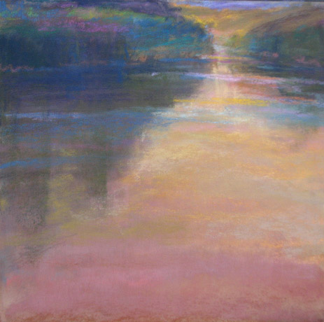
So this painting is the proverbial "rabbit out of a hat." I made this one up with just memory of what light looks like and a desire to paint warmth.  WHERE did it come from? Where is this landscape? I don't know. Maybe from the recesses of my mind.
So now I come back to you blogger friends, what is stopping you from trying? You might fail...but does that really matter? Finding the painter inside you is more important. So I challenge any painter..try a memory painting this week. Enjoy. Send me a jpeg so I can enjoy with you.

The memory painting guidelines, adapted from Whistler.
*watch a scene, then turn your back and in words describe in detail. If you have someone with you have them correct if you are wrong. Do this till it is secure in your head. No photos or sketches.
* Wait 12 hours, allow the scene to be created in your head
* Paint, using only that memory. Your knowledge and understanding of light will stream in and guide you.
* I will be happy to post a jpeg of your painting on my site, with credit to you, of course.

Yes, I will go back to reference material, probably using my plein air studies as I always did. But now when I return to using something in front of me I will do so with a new mind.

Tuesday, February 1, 2011

Memory and the Key Bridge, more Carlson

9x6  pastel and watercolor on uart

 The Potomac River in all its glory is right near the hospital where I stayed. The bridge closest is the Key Bridge, a beautiful old arched bridge- a bridge Whistler would have loved. I tried to paint it as I saw in autumn when I went to the hospital for tests. (back then I was afraid to try all memory paintings, heh) This is of course, all memory, no references.
All I am trying to do is create a believable landscape with the kind of color that makes me say ,"ahhh." Some parts in this one work  and some parts need tweaking. (next time) One thing  have learned is that it is just as important what colors are underneath as what colors are on top. I carefully dance the pastel on top so that the light from the color below glows through the top layers. Some marks are smudged, pressed, brushed, erased and some just placed on like a whisper.
One more great quote from Carlson,
"Trust your feelings entirely about color, and then, even if you arrive at no infallible color theory, you will at least have the credit of having your own color sense."

It was perfect timing to read that. I am now beginning to reread Robert Henri. More about his writings next time.
By the way friends, I am sorry if I have not made it to visit all the blogs I normally enjoy seeing. I still love seeing your work and reading your posts. In time I will be back completely.