Wednesday, November 26, 2014

how to choose a subject and you make the painting


I parked my car in a small lot in Sligo Creek Park. The sun was low so I knew I only had maximum 45 minutes till it had dissappeared for the day. Choose and choose fast. My brain told me- "You make the painting, it doesn't have to be there."

Which brings about another favorite Wolf Kahn quote.
 Choosing a Scene in a Landscape: "Avoid cliché when looking for places to study and paint the landscape. Often, when I’m observing a scene I want to paint, I look for chaos. Chaos in nature is immediately challenging and forces a good artist to impose some type of order on his or her perception of a site. When I find a scene that provides that type of challenge, I return to it over and over again, both physically and mentally in the studio, continually searching for new insights."
"A studio visit with Wolf Kahn" by Jonathan Phillips, American Artist magazine, 1 May 1997

Happy Thanksgiving to my friends from the U.S.!

Saturday, November 22, 2014

365 Hints and Tips for Drawing and Sketching


Katherine Tyrrell has outdone herself. Not only does she have the number one art blog in the UK and 11th in the world, but she also now has a new book! The book titled, 365Hints and Tips for Drawing and Sketching is getting great reviews already. A quote from the publisher on the back cover is it in a nutshell"a far cry from other dry, run-of-the-mill art instruction books" The book has two editions one by Asian publisher (Page One Publishing) and another produced by North Light Books, titled Drawing 365: Tips and Techniques to Build Your Confidence and Skills. For a treat you must check out Katherine's blog, Making a Mark. Here's the link.

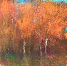
I am honored to have many of my pastels included in the book, including Beltway Bliss which is on the front cover! Thank you Katherine! I can't wait to see the book in hardcopy.

Here is a review of the book from Parka blogs:
"Here's a book I received from Page One Publishing. It was on my shopping list initially.
There are actually two publishers for the book. Page One Publishing is distributing this book for Asia under the title 365 Hints & Tips for Drawing & Sketching while North Light Books has it as Drawing 365: Tips and Techniques to Build Your Confidence and Skills. They have different covers.
The author is Katherine Tyrrell who's also the blogger for the rather popular art blog called Making a Mark. She also draws and paints and some of her artworks are in the book.
As the title of the book suggest, it features a bunch of hints and tips on drawing. The idea is to use one of these tips each day, to try something different, have a new artist endeavour, explore, experiment. It's more like a motivational book to get you to draw day, and in fact some of the text are motivational tips.
You'll need basic drawing skills to get the most out of the book because the book does not cover much on the techniques.
It's a fun book to follow along and you can create your drawing schedules using the ideas provided. The book is split into three parts. The first covers the basics, second on the subject matter that you can draw and third on materials you can try out.
There are many interesting and useful tips, such as on tackling pet commissions, how to light a still life, draw buildings without understanding perspective, mixing up your drawing medium, ideas on places to draw, things to look out for when drawing certain subjects and the book also covers the basic art fundamentals like observational drawing, composition, proportion, etc. It's a book you can dive into on any page. I like the variety of tips even though some are rather brief but still useful nevertheless.
It's a good book for those who like drawing and sketching.


Thursday, November 20, 2014

a trip away from descriptive

A plein air piece that visited the studio to partial obliteration and resurrection. It was quite a journey, but it brings my work my more much farther along on its journey. I am actually happy with it.

Monday, November 17, 2014

what's too descriptive?


When painting I always struggle to keep away from being descriptive.  I actually find myself getting bored of a painting when I say too much. I teeter on this precipice what is enough and too much? How much can I keep out of the painting today and still feel place and beauty through color. I often will wipe the pastel so that edges blur and I get to bring it back. In oil I will wipe before leaving that day. That allows me to work fresher the next day.
Now a quote from my sketchbook  "When a work becomes too descriptive, too much involved with what's actually out there, then there's nothing else going on in the painting, and it dies on you."  Who else?      Wolf Kahn
This painting is from Sedona, in the Cottonwood area. It's a tree I have painted many times in my quiet field by the river. I can't wait to get back there.

Thursday, November 13, 2014

Monday, November 10, 2014

Wolf Kahn, grays / bright colors and field, early morning


10x11 pastel
This week I was asked why do I put so many bright colors in my paintings? You don't really see those do you? My only answer was that "my painting was a response to the scene rather than a depiction." I hear in my head, "Loriann you need to balance all that bright color with grays." That's what we have been taught, right?  I think balance is true, but does it have to be just neutrals? Can't the weight of volume and density of color answer the call as well?
So I turned to reading about Wolf Kahn, a master of color and balance. He too was asked how does he make all these brilliant colors work in a painting. (great company to have) WK answered, “The only time I feel comfortable is when I don’t know why the colors work,” he says. For him the act of painting is a conversation. You don’t control it; you respond to it. “It’s useful to think of a painting as a pet. If you have a pet, you give it food and it doesn’t overeat. Yet somehow if you haven’t given it enough, the pet will let you know it and you give it more so the pet is satisfied,” he says. “Painting isn’t really all that mysterious. You just give it enough till it’s satisfied.” Sounds easy, eh?
Letting go of control seems to be the answer of the month.

Thursday, November 6, 2014

the best control is no control

8x8 finished pastel Silver Divas

“One always has to combat being goal-oriented. Somehow, you’ve got to have a sense of play—a sense that there are things happening when you paint other than your wishes and dreams at the moment. I’ve learned not to constantly be self-critical. I don’t really care whether a painting comes out one way or another.” Of course, he cares that the elements are balanced, that the questions are asked and that the problems are resolved. But, he says, quoting a Zen koan, “the best control is no control.”
Wolf Kahn

This painting was done on location. It was an overcast day, therefore I had to find new guidance. Previously I have chosen tree groupings in which light would hit some trunks making a melody in the trees. Today there was no such light, but this silvery grouping excited me.

watercolor step one

watercolor step two

Monday, November 3, 2014

Hans Hoffman, Color and the field

10x11 pastel

When you read about Hans Hoffman's teaching, color was not used to copy nature literally, but to make relationships, mass and luminosity.   Nature inspires but does not control. We, instead are in charge. Our choice of color is intuitive and expresses feeling.
You must consider that colors have look different depending on whether their edges are hard or soft. Whether the change in value at these edges is smooth or abrupt (as I experimented with above). The appearance of color is affected by the color adjacent.  Simultaneous contrast is really what the relationships are all about.
Since I have returned home I am haunting my fields. As a compositional challenge I also purposely put that tree right in the middle. Heh.

Sunday, November 2, 2014

Copse of trees


In Sedona my host and I were talking about the word "copse" which means a small group of trees. That word tumbled around in my head that sleepless night. It generated an image, this image. I only had to go paint it....which I did the next day. It's large for a pastel done on site-  12x24 (for me). The hardest part was that it was an oblong and I really prefer squares. The frame was ready but I procrastinated using that piece of paper till the last possible moment.
The sick part was, I purposely chose to put the main focal point right in the middle. That choice challenged my ability to make fluid movement throughout the piece.
To frame it I floated it n a piece of black board, which you see a sliver of on the right side.
A friend of mine emailed me to say her friend posted this photo on FB Tuesday. She asked...Is that you? And yes..it is. Taken by a drive by photographer.