Showing posts with label composition. Show all posts

Monday, March 5, 2012

the diva and her entourage:composition

pastel 10x10
 If you didn't catch Robert Genn's post in the Painter's Keys last week please check out this link. It's a must. The post labeled "six compositional boo- boos" shares important information we know, but, speaking for myself, sometimes simply forget to use.
detail/diva
Paintings are rarely "good enough." Genn gives 6 tools to help you examine your work.
The third "boo boo" labeled "amorphous design" talks about the cornerstone of good composition. I have always thought of it as the diva  (focal point) and her entourage, which consists of two smaller points of interest. These points should form a triangle (during the Renaissance many artists preferred the equilateral triangle, although most artists now use an unequal.) The points direct the viewers eye, practically providing a map of driving instructions. Many paintings fail either because this diva is not evident or her supporting cast does not exist, thus leaving the viewer floundering and uninterested.
The painting above was one I completed this winter. It fell flat until I heightened the distant land mass and sky- making the diva more apparent. The blue in the top left sky and the orange in the mass of trees left were my pivot points.

PS When you check Robert Genn's post be certain to sign up for his twice weekly letters. The post is one of his wonderful letters.

Monday, March 28, 2011

abstract design and concept

about 12x6 pastel on Uart


I said that I would write more about reducing shape and simplifying.
Reducing and simplifying is not just about eliminating detail (although I will talk more about that later) it's much bigger than that.  To work out my ideas I  revisited the Friday's painting in which I lost my focus.
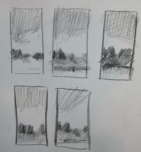
Why did it not work? The main reason was because the concept (a tumultuous Spring sky and the way the light played on the landscape) was not supported by a good abstract design. Good abstract design which appears in strong compositions is the key upon which all good paintings are built. Creating a notan helps and I hate to admit it's a step I skipped that Friday afternoon. So now I have redone it.
Just using my memory I created new sketches and  grisaille. With a limited palette I made a new pastel with a better design and feel.  Now I think I will go back on site and try it again in plein air.

Tuesday, October 5, 2010

making a composition

Believe it or not this painting began as my soccer/basketball field. You may seem some similarities. The idea came to me when I was on the field observing a nocturne. Darkness makes the important shapes come forward. Like a sculptor I gradually carved away at the landscape to create something pleasing. A reflective surface and distance weaving back were fabricated to make a composition with interesting values.
The focal point is in the bottom right point, according to the rule of thirds. The rule of thirds is a compositional tool which shows you the sweet spots. Each time the lines intersect there is a good place for your focal point.
 Here is a tiny drawing that shows my notan and compositional lines. The lines show where the movement happens in the painting.


Later, while reading Composition and Perspective I noticed the similarities in composition to Constable's famous The Cornfield.  Not that I am saying my small painting in anyway resembles the greatness of Constable..just that there are compositional similarities. I read that Constable regarded this painting as one for his best researched works. He made studies of every detail before building it into a satisfying composition. The parts did not appear in nature in the same positions as they do in the painting. He did what all painters do, he moved things.
So painters, feel the power! Just because you see it that way doesn't mean that you paint it that way.