

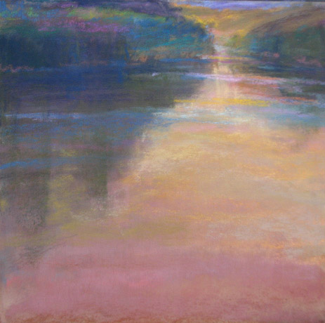
The colors in the plein air painting really do show the time of day I hope to create a real mood to this painting. I can feel it. The value scale will be darker and close....small lights will peek through. Somber, bittersweet with hope.
Here are a few:
Squint (but that's always, right)
I like to use the subtractive method. On soft paper (somerset is my paper of choice) use pastel to make big shapes. With a rage and fingers I smooodge it and then with a kneaded eraser and a harder eraser I subtract lightly...make a small mistake add more pastel. It's very forgiving. Enjoy!
7 comments:
I know this is a learning opportunity as you press the issue of value. True, true, but I still think the color versions are strokes of genius.
Beautiful B,
pb
I think this VS is sublime. Love it.
Plus, I've been there. I just put that in so everyone else will be envious.
Hi PB,
Heehee...press the issue of value. I hope no one else takes offense at me pressing this issue. I guess this blog sometimes is like a working diary and this is my issue now... but I think you know that. Hope your painting day went well.
Hi Casey,
Yes you remember the slough..the one that has my key..or should i say the baby bear has my key. That was a fun painting morning and breakfast!
Thanks about the VS.
Hi b,
Sorry if it sounded like I was taking offense.
Not sure how I chose those words, never used them before in my life. Everyone loves it when you press the issue. We love your Passion and your willingness to share with all of us
Pb.
Loriann, I teach a workshop (watercolour) in tone and value…. and think the importance lies in ‘taking colour out’ and reducing the image to chunks of value and the pattern of light. Once this concept is grasped, using colour is the icing on the cake. Of course in watercolour (unlike indirect painting in oil or pastel) you can’t really build a tonal under painting and add colour on top (although I have been experimenting with this lately without too much success).
One of the things which really hits home to me is that after painting in monochrome for a while, when I get back to using colour it’s like falling in love with colour all over again.
One of the things I love about soft pastel is “my colour fix’ (kind of like your fix of daily paintings as daily vitamins)…. and the immediacy of colour, opposed to watercolour where passages of colour are generally built up with layering and glazes and drying time in between.
When you have more time you should try painting nothing but value studies for a week or two (no painting in colour at all in any media)…then see how wonderful and fresh you eyes are when you begin with colour again.
Don’t get me wrong…. I can make equally bad messes and uglies in monochrome as I can in using colour (lol)......a bad composition is a bad composition ……which reiterates that it really is all about light and light direction that sets the mood.
Hi PB, Just a little sensitive I guess...I just wanted to let you know that the only person being pressed is me. FLAT.
Hi Maggie. When I was in school I did only value drawing for an entire year And since then I continue to do more. I think that each time I press this issue the realizations come on different levels as I search inside to find MORE. I probably could come back to it throughout my life.
Post a Comment