Showing posts with label La Conner Washington. Show all posts

Monday, September 18, 2017

we can't be creative if we refuse to be confused


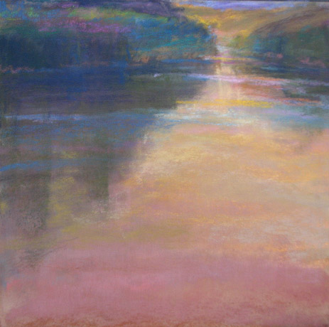
pastel, 19x19

Embrace confusion.
We can't be creative if we refuse to be confused. Change always begins with confusion; cherished interpretations must dissolve to make way for the new. Of course it's scary to give up what you know, but the abyss is where newness lives.  great ideas and inventions miraculously appear in the space of not knowing. We must move thru that space that is bathed in fear. On the other side is the reward...beauty reinvented.

I was reading an article by Margaret J Wheatley titled, Turning to One:Simple Conversations to Restore Hope for the Future. This is basically what she said, but interpreted to art/painting. It has stayed with me for the past year. Think about it and tell me what you think.

Friday, August 18, 2017

paint what you love

Washington State
I have been traveling (without my computer) for most of the summer. I have missed posting and will try to wrap up my thoughts in this one post.  When I thought about where I go when I travel I noticed a thread. I paint what I love.
Chincoteague
1. I return to the same place, sometimes even the exact same field for 10 plus years, like I do on Whidbey Island
2. lI ook for the same concept over and over- fields or water with large masses


This year my obsession with fields extended to working with the horizontals and verticals that break the monotony of simply horizontal planes. Chincoteague and Washington State seem to rule. The bottom line is I paint what I love and know intimately. I am not searching for the next big thing. I am not painting postcards to "remember my trip."
The concept is already here, in my head.
Prince Edward Island
Think about it, why do you paint what you paint?

Thursday, August 13, 2015

seduction and the notan


Here is another notan and painting.
Don't get seduced by subject matter. The notan helps with this. It helps you find balance between darks and lights. It makes you change things that are there in order to find the balance. It helps you find the rhythm and the strength in that rhythm.
it helps you find the right shapes and that make your painting more powerful.

Tuesday, August 11, 2015

the power of a notan/ light your painting on fire


Want to light your painting on fire?
 I am going to give you a tip- notan. Yes, I have been taught to do notans for a long time. (And you probably have too.) I have done them in a perfunctory manner, never really getting their full worth. The lightbulb finally turned on last week.
Let me step back a moment....   Once again I traveled to Washington State to paint. I am fortunate to spend a week painting with Richard McKinley each year. He is truly the best teacher/mentor I know. I feel as if it is my check-up with the doctor. I work as his coordinator/assistant. I get to paint each day, hang out with my friends and absorb his wisdom.
This year I (finally) understood the real reason for doing the notan.

Notan is the Japanese word that translates to mean- light and dark harmony. It refers to the arrangement of light and dark that serves as the foundation for composition. With a notan you find the essence of your painting in the design.

To explain, when I began I did a small pencil sketch (top sketch). That complete, I found the major design lines and then made two more sketches with just the lines. Next, on the middle sketch you see I translated the sketch into 4 values -white, medium gray, and small places of darkest dark. (I did an extra one on the side of that) On the bottom sketch I combined the two darkest values and made the design against the white. When I moved to the bottom sketch I saw the need to change some of the placement. Notan makes you look carefully at "what is important? "How do I make my rhythm within the colors and shapes?"

Doing this small addition to your painting set up can change your world!

In the painting above notice how the notan allowed me to alter color so easily. Once you know your value design you can make the painting work, even when you create major changes. This scene was all green.
Let the notan be your guide.
I will post a few of the paintings and their notans for the next few days and you will see what I mean.

Wednesday, October 8, 2014

more texture experiments


Another version of my work with texture. It's on multimedia board. The multimedia board is amazing in the way it spotlights watercolor underpaintings. It easily accepts applied texture with no worries of warping.

Multimedia boards are acid and ligin free, ph neutral and impervious to mold and mildew. They will not warp, no mater what the media. The sparkling white surface is wonderful. Here's the link to check them out at Dakota Pastels. let me know what you think.

Wednesday, September 3, 2014

learning what to sacrifice


“The value of memory sketches lies in the fact that so much is forgotten! In time we must learn to leave out in our finished pictures these things which we now leave out through ignorance or forgetfulness. We must learn what to sacrifice.”
Dwight William Tryon

Sunday, August 31, 2014

dusk-a-thon, greens and golds

Using a different palette, at a new location, the dusk-a thon continues through the summer. There is always 20 minutes to do another small painting.

BTW There have been many questions about the texture in the last painting. Later this week I will post another from that series and give more detail about the method.

Monday, August 18, 2014

super moon in La Conner

pastel, 11x12- above and below- two version, different methods
Saturday night was the super moon. Even though I had to pack and clean my little apartment (I was departed La Conner early the next morning) I couldn't resist making a sketch (below) and stuffing it in my sketchbook. Now back home, in the studio, I made 2 -11"x12" paintings from it.
5x6 pastel

I am working in a slightly different method. Richard suggested a light application of gesso on my paper.The different versions use the gesso at different times.

Friday, August 15, 2014

value does the work


After spending six days with Richard McKinley, my annual visit (to the doctor of pastels) I am left once again pondering the most important phrase he shares. "Value does the work and color gets the glory." If you can't make it read in just value it will never work. Plus, I think that the mood of the painting should work in b/w. This is a study from my favorite slough.

Saturday, February 1, 2014

Let go

plein air, pastel, this past summer


“Without trying to describe elements, I try to ex- pand possibilities, and the feeling of freedom. I have general knowledge - I’ve trained - but when it comes to a particular painting or pastel, I trust in freedom, and let go.”    Wolf Kahn

He says it all, doesn't he?

Friday, July 27, 2012

memory painting

Underpainting possibilities are so numerous it's almost crazy! When I was shopping at Dakota Pastels I found this cool stuff called Liquid Spectrum- Concentrated Artist's Ink. Waterproof and intense  it proved to be an excellent first layer.  It easily layered with watercolor and then pastel. Playing is part of the job!
On another note I think painting from memory allows me to relish the materials even more!

Monday, July 23, 2012

juicy stuff on the way

My week in Washington was amazing, as always. I always love be in that gorgeous place and gather new insights from Richard. The pinnacle was learning a new method for creating notans and discovering its use to strengthen my work. As soon as I can, I will post step by step instructions.
This painting was one I did one very early Tuesday morning- I was alone at my new favorite site in Mt Vernon. The chattering birds were the only sounds. There was a silvery glow to the sky and water. I used the notan method to make my design and below is the notan that guided me. I must say that since I was trained as a painter, not a graphic designer- my design was never my strongest aspect. Now, with the new Richard method I think I can change and develop a stronger design.
Stay tuned for the new method!

Friday, August 5, 2011

retro fave: dominant value affects color choice

about 10x 16 pastel on Uart
 When making the decisions about your painting, before you begin to paint you need to choose a dominant value. On the value scale, what will the majority of the painting be? (This one is a 1.5/2)

notan
  After making your notan you have the map. It helps to think of you values as abstract shapes and not let those little accents you see divide them. In this painting I planned three main values, but because I decided to paint fog the values needed to be closer together with the foreground enjoying a dark no darker than a 5, with just small accents of a temperature change for drama.
This is a long way of saying that yesterday when I was cleaning out my drawers I found this piece. I was ready to trash it when I said no, it has hope.
It is the view from the wonderful home where I stay when I am in Washington. The Tivel family graciously allows me to share their paradise each year. One morning when the sun was out (rare) I painted this. It was all wrong. Mixed up values and not enough dramatic separation. Plus the bushes in the front too closely resembled the large trees in the distance. Egad! What a mess-up!
Then I thought about the way I KNOW this view- covered in the morning fog. Nine months removed from the actual scene and no photos to use, I was FREE! I rubbed, sprayed and layered. All I had was my memory and a wiped painting. The offending verion is below. Thankfully it is gone now. I live by the motto, "if it isn't delicious, it isn't precious."

old version

Monday, July 18, 2011

visions from Washington


Hi everyone!

It has been a few weeks since my last post. Thank you to all for the very understanding comments and emails. I have kept my computer closed and have only allowed myself 5 minutes to answer emails. Due to my time changes I have had  at least 5 hours a day in the studio and the time to teach  a week long  (1/2 day) workshop. At night I  continue planning my new studio. Priorities.
As far as articulating my direction; my trip to Washington made me realize that my goal is to erase the superfluous from my work and distill it down to just what is essential. Sounds easy, eh? Not so for me.  In a few days or so I will share a little studio work, but for now I share a few from my time in La Conner, Orcas Island and San Juan Island. They are my more successful pieces...although not quite what I am aiming for, yet.
Thanks so much for your supportive words. Toodles for now!

Sunday, June 19, 2011

Richard McKinley Workshop -day 1

I haven't had a moment to blog! This is a painting from my first day (yesterday.) The painting itself did not thrill me, but the fact that fellow blogger, Astrid and I both found the same site was fun. It's always great to meet another blogger! Even better, this time, Astrid Volquardsen and I will get to know each other since the workshop is 9 days long.
As you probably know, each year, I return to Richard's workshop. And while my painting is not like his (nor will it ever be), I have always felt he is the best teacher there is. Each time I hear his words I am in a new place in my own development as an artist.  Therefore "ah ha!" moments continue to happen.  I will share today's "ah ha" excitement tomorrow. For now, I need to drive back to my place and sleep so that I can get up early tomorrow.

Tuesday, February 22, 2011

value, mood and tips

Here is another value study. It is of my favorite slough in Washington state so I  used a plein air piece as reference. No photos...it's all in the plein air piece, my memory and my built up reference folder in my head.
The colors in the plein air painting really do show the time of day I hope to create a real mood to this painting. I can feel it. The value scale will be darker and close....small lights will peek through. Somber, bittersweet with hope.
 I was asked in an email for tips about creating value paintings.
Here are a few:
Squint (but that's always, right)
I like to use the subtractive method. On soft paper (somerset is my paper of choice) use pastel to make big shapes. With a rage and fingers I  smooodge it and then with a kneaded eraser and a harder eraser I subtract lightly...make a small mistake add more pastel. It's very forgiving.  Enjoy!

Thursday, July 29, 2010

last one from downey road

 
9x12 I think) pastel/watercolor on Uart
Before I left for the Olympic Peninsula I had to go to Downey Road once last time. It was beautiful.  My question was , what IS essential? What can I leave out and make a stronger feeling? I began by underpainting in the skeleton colors in effort to create a glow from underneath. I am once again trying to leave more of the underpainting showing. Consciously  choosing, more frugality.
 

I really wanted to paint the way it felt, and ignore the details of how it looked.

Wednesday, July 28, 2010

the light game and an interview

Once again I experimented with differences in texture: reflections in water and air in skies. But the main thought on my mind was threading. What do I mean by threading, you say? Well, since I decided that the light fog/low lying clouds made a violet light I knew that violet was the color that needed to thread through the entire piece to harmonize. The places where the light came through were golden. Important pieces of information to keep in my mind each time I would chose a color.

Speaking about the color of light...I have been playing the "light game" where ever I go and you can play it too.... even when you aren't painting.  Observe the light. Then close your eyes and describe it in full. What is the color of the air? What color threads through the entire landscape? What are your lights doing? What color would you describe the sky and its light? Be specific. Tonight when I was hiking in the dim light, it seemed as if the sky was a white gold glow. Naming that I tried to choose (in my mind) which stick of pastel I would use and what would be the underpainting. All this and I didn't even have my paint stuff with me.

Whistler used to challenge himself. He would absorb a scene, its every color. Then he would turn his back and describe it in full. His friends were free to correct him. I doubt that he was wrong.

On another note, during my workshop study time with Richard I was slowly, question by question, completing an interview with him. We never did finish all of my questions. I will save them for another time, but we did cover many questions. So, hold on to your seats, another treat is in order for you.... a special interview with the pastel god himself, Richard McKinley. Since I am still traveling you must be patient. ;-)

Monday, July 26, 2010

the bird sanctuary, lessons in plein air oil

 
6x6 oil on board
I know all my ..well most of my faults in plein air oil. It's almost like I forget all I know.
Wait, let me try again....... I will try to put it in the positive. 
1. I will fracture color less and have more sweeps of color so that way the viewer can enjoy the fractured color....it's like being on a diet of cookies only. 
2. I will be certain to paint in a higher key. To do this I will begin with the sky and keep it an 8.5 or 9. 3. And the issue that pertains to all painting- pastel or oil, I will spotlight the diva and lose the edges and focus in the other areas. Confessions....I am done for now.  ;-)

Saturday, July 24, 2010

oil plein air with Richard

6x6 oil on canvas
So now I have begun the 3 day oil plein air workshop. Normally I only use oil in the studio...so this is very new. ...and exciting!
Richard's methods are different that I know already, but they really make sense. Imagine. If I haven't said it before I  will say it now...I think Richard is the best teacher anywhere. He can explain anything. He is meticulously organized which means his ideas and methods are very structured and thus easy to understand. I can go on and on (and at another time I will), but if you have one workshop to go to ...make it his. You will not regret it.
A brief synopsis of his method- color harmony created by a small selection of colors, mixed greens, purples, oranges and grays/neutrals. Like pastel painting, it is imperative to plan your value design with notans. There is also a monchromatic, rubbed out painting in burnt sienna underpainting underneath this. That's the basic. I promise that I will explain in depth later. For now I have to go to bed.
This is Richard when he was painting at the slough last night...the same place I painted with Casey.