Showing posts with label the slough. Show all posts

Monday, September 18, 2017

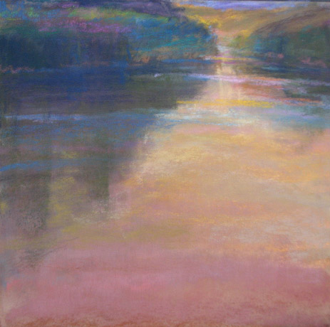
we can't be creative if we refuse to be confused


pastel, 19x19

Embrace confusion.
We can't be creative if we refuse to be confused. Change always begins with confusion; cherished interpretations must dissolve to make way for the new. Of course it's scary to give up what you know, but the abyss is where newness lives.  great ideas and inventions miraculously appear in the space of not knowing. We must move thru that space that is bathed in fear. On the other side is the reward...beauty reinvented.

I was reading an article by Margaret J Wheatley titled, Turning to One:Simple Conversations to Restore Hope for the Future. This is basically what she said, but interpreted to art/painting. It has stayed with me for the past year. Think about it and tell me what you think.

Friday, August 15, 2014

value does the work


After spending six days with Richard McKinley, my annual visit (to the doctor of pastels) I am left once again pondering the most important phrase he shares. "Value does the work and color gets the glory." If you can't make it read in just value it will never work. Plus, I think that the mood of the painting should work in b/w. This is a study from my favorite slough.

Thursday, April 7, 2011

the slough and the secret of life

18x18 pastel on art spectrum
Neutrals are the secret of life. It's as easy as that.

Each summer I spend as much time as I can in the Northwest, in particular La Conner and Orcas Island. Those two places just fill me with awe and inspiration. This painting had its start in the studio last summer. Memories of my favorite slough ignited the work. It's the same slough where I lost my key, met the baby bear (while looking for the key) and painted with Casey.
Since summer the painting has sat in the corner (staring at me) for 8 months. Yesterday I looked at it and I knew what to do. It was simple. The secret was in neutrals.

Tuesday, February 22, 2011

value, mood and tips

Here is another value study. It is of my favorite slough in Washington state so I  used a plein air piece as reference. No photos...it's all in the plein air piece, my memory and my built up reference folder in my head.
The colors in the plein air painting really do show the time of day I hope to create a real mood to this painting. I can feel it. The value scale will be darker and close....small lights will peek through. Somber, bittersweet with hope.
 I was asked in an email for tips about creating value paintings.
Here are a few:
Squint (but that's always, right)
I like to use the subtractive method. On soft paper (somerset is my paper of choice) use pastel to make big shapes. With a rage and fingers I  smooodge it and then with a kneaded eraser and a harder eraser I subtract lightly...make a small mistake add more pastel. It's very forgiving.  Enjoy!

Friday, November 12, 2010

another version of the slough and value

This is a much bigger version of the slough(18x18) which I have been working on for the past 6 months (granted 3 of which I just looked at it and grimaced.) After speaking with Deborah, on Wednesday, I have been thinking about value. Wondering about how my use of color and temperature that sometimes sacrifices value. So that is my next focus.

It's funny that what I know...I don't do. I realize that value directs the eye. Place the darkest dark and lightest light in the focal point. Have a dominant value.
Painting is continuous discovery and learning, so full of duh! moments.

Sunday, July 25, 2010

the slough at twilight

6x6
Last night after the sun had set I zipped to the slough. I needed to try to paint it. The light was so minimal and I didn't have a light source with me...still I needed to try. Another good reason for keeping all your pigments in exactly the same places. I had to count on knowing what the color I would mix would look like without really seeing it. Good practice all round.
I also kept in mind the concept of simultaneous contrast. Example- I wanted the water to appear to be a glowing orange- so I places a blue near it in a couple of places. I wanted the sky to appear bright and glowing so I made the landscape touching it more neutral and darker.
My palette includes:white, cadmium yellow pale, cadmium yellow medium, cadmium red, alizarin permanent, ultramarine blue and viridian. An orange, a violet, and a base green are mixed and added to the palette. These are made from the colors already on the palette, which adds to color unity. In addition,  row of grays was also pre-mixed. More harmony. I will talk about those next time.
One more day of workshop. I will be sad when it is over. whaaa.

Friday, January 29, 2010

step by step, work in progress

8x10 oil on canvas
As you can see recently I have been working with  a lot of oils. Aware of my lung ailments, I am trying to give my lungs a rest from particles floating in the air. At least with oils the particles are stabilized. The principals are the same. Some aspects are harder; some are easier. To work in glazes requires much more planning and lots of patience waiting for them the dry before applying the next layer.
This one is still waiting for another layer...I think.

Friday, October 16, 2009

Nocturne, #1


8x10 pastel on Uart
Done from memory and notes from the summer, this painting started with a grisaille, upon which I pasteled directly (no watercolor.) hmmmm. It's my first attempt at a nocturne. I have had it in my mind for a long time, I simply had to soak up the color and understand.  This is the added on version. The first I posted at 5:30 am. When I returned to the studio at 1:00 it was obvious the painting needed more (thanks Doug.)
Maybe someday I will try to rig up my easel for plein air at night. Any tips friends?

Thursday, August 13, 2009

dusk slowly begins to pour the syrup of darkness

finished piece 18x18 pastel on Uart paper
after the first layers of pastel
7/31 watercolor underpainting 2nd layer
7/30 sketch
Using our small plein air paintings as fodder for creating bigger more conceptual works is a blessing and a challenge. While we artists know that photos lie and can not capture the same feeling that painting your own preparatory work can, using one's paintings still is no picnic. Most importantly, you have to develop a firm concept before attempting anything. (Am I sounding like a broken record?) I find that making written notes about the feeling and the place helps.
George Inness made his field sketches and then put them away for later reference separate. He wanted separation. I prefer to start from the plein air to the concept piece as soon as the idea is clear, preferring less space rather than more.

What do you prefer? And why?


Later there is a point in the process when the painting begins to speak. It's like the runner's high. It's that moment all artists love. All reference material can be put away...the trip has begun.

This painting was created from all my work at the slough this July.

Friday, July 31, 2009

Like Moths to Light

9x9 pastel on Uart
underpainting
My last painting this year in La Conner. Goal: restrict and pre-select my palette. Paint with a sensitive, yet joyous hand. I felt completely saturated with the beauty of this slough in the early evening light. Longing.

Monday, July 20, 2009

Bedtime Lullaby for the Kingfisher (and me too)

9x12 pastel on a new surface
After a day in class, in which I painted terribly, I knew I needed another painting rather than dinner. I returned to the slough and just enjoyed color. No real goal just enjoy color. Ah...now I feel relieved and can go to bed!
Yes, I will write about Richard wisdom when time allows.
PS I posted this one last night.

Sunday, July 19, 2009

Decompression

9x9 pastel on Uart
After the class was over I continued to work at the slough. It was simply a painting to decompress. Taking in information and trying to learn and change old habits is stressful. Painting to let loose was my solution. Not great, not a dog...just there.

Saturday, July 18, 2009

Kingfisher's Home at Sunset

6x6 pastel and watercolor on uart
watercolor glazed on top of a one color notan study
one color pastel pencil with water grisaille
After listening to a full day for Richard's amazing wisdom and having the time for one painting (post that another time.) I was not prepared to stop. I grabbed a bite to eat and headed for one beautiful slough (long bodies of water made to bring water to crops). This year Richard is teaching a method that uses the grisaille, watercolor and then pastel. Really cool for making values correct. I am working hard at color harmony (as always) and for this one done on my time I condensed and took out the sky. I will post much more Richard wisdom when I have time. He is AMAZING! I have been fornute to work with him for many years now. He always pushes me another step and then I can go back and work in the studio for a year....re-energized
The whole time I was painting the kingfisher was calling to his mate. This is for them. I love kingfishers!