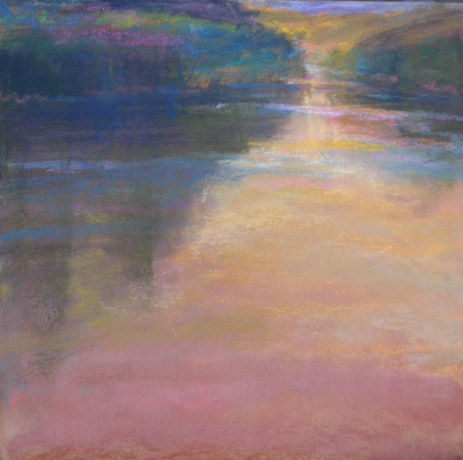
The master Jean-Francois Millet wrote in a letter, "If a sketch seen in the dim half light at the end of the day has the requisite balance- ponderation- it is a picture: if not, no clever arrangement of color, no skill in drawing our elaborate finish, can ever make our a picture."
That said- as one surfs the slippery tide of color vibration one can easily get lost. My solution is to also spent time making large value pastels. It's one of those catch 22s. The abstract of the painting is always the mos important..if that doesn't work it will never work. We want to be free to answer to the painting rather than impose the "scene." Therefore I make these and then put them aside.
Showing posts with label importance of value. Show all posts
Monday, March 13, 2017
Friday, August 15, 2014
value does the work
Wednesday, July 10, 2013
retro fave-importance of value paintings/studies
9x12 pastel on BFK
As you know I have been creating many value paintings recently. I started doing these works as grisailles for pastel and oil glazing. Next, I began to really like doing it. The value paintings are different than the notans, which are small studies with only 3 or 4 blocks of value. These I do before beginning bigger works to determine value patterns and dominant values.
Now add the idea of a full value painting.And after creating many I have came to the belief that it is imperative to do these before beginning big works. It really helps me work out the main issues before heading to the juicy stuff-color.
Most artists know that normally the sky is the lightest value, followed by the horizontal planes reflecting the sky, next the slanted planes and the darkest are the vertical planes. Doing the value paintings allows me to work out the other nuances and hopefully some of the obvious mistakes. Mistakes like making the sky too dark in value or nuances like how the movement works, or how the shapes work together.....are they interesting or redundant? The value paintings also stress how you, the artist are the conductor of the painting. Like a symphony you decide how you want the musicians to play together...darken one...lighten another? You choose. When it is in black and white it is so easy to see.
It's also good to do these value paintings if you are stuck in you painting. What you can't see in color you can see in black and white. It's funny how we (I) can overlook things we KNOW inside when caught in the frenzy of painting.
Have I convinced you to try one?
As you know I have been creating many value paintings recently. I started doing these works as grisailles for pastel and oil glazing. Next, I began to really like doing it. The value paintings are different than the notans, which are small studies with only 3 or 4 blocks of value. These I do before beginning bigger works to determine value patterns and dominant values.
Now add the idea of a full value painting.And after creating many I have came to the belief that it is imperative to do these before beginning big works. It really helps me work out the main issues before heading to the juicy stuff-color.
Most artists know that normally the sky is the lightest value, followed by the horizontal planes reflecting the sky, next the slanted planes and the darkest are the vertical planes. Doing the value paintings allows me to work out the other nuances and hopefully some of the obvious mistakes. Mistakes like making the sky too dark in value or nuances like how the movement works, or how the shapes work together.....are they interesting or redundant? The value paintings also stress how you, the artist are the conductor of the painting. Like a symphony you decide how you want the musicians to play together...darken one...lighten another? You choose. When it is in black and white it is so easy to see.
It's also good to do these value paintings if you are stuck in you painting. What you can't see in color you can see in black and white. It's funny how we (I) can overlook things we KNOW inside when caught in the frenzy of painting.
Have I convinced you to try one?
Thursday, March 21, 2013
cloud study
Here's one of my recent crazy cloud studies. It's 21 x21 black pastel on white BFK. When limited to black and white it's much easier to see the "bones" of an upcoming (possible)painting.
A quote from Jean-Baptiste-Camille Corot-
“The first two things to study are first form and then values. Those two things are in my opinion the foundations of art. Color and execution add charm to the work. It seemed very serious to me to prepare a study or a painting by starting to indicate the most vigorous color values (assuming the canvas is white) and to continue by following in order until you reach the lightest value. I would give 20 gradual numbers to go from the lightest to the most vigorous color value. Then your painting or study would be established with order. This order must in no way bother the sketcher or the colorist. Always the mass, the whole, what struck us. Never lose the first impression that moved us. The sketch is then the first thing to look for. And then, color values - the relation between forms and values. Those are the foundations. After the color, finally, the execution. Do you want to do a study or a painting? First you must apply yourself to look for the form in conscience. After having made all the efforts of application, move on to values. Look for them with the mass. Conscience. A good way to achieve this: if your canvas is white, start with the most vigorous tone. Follow the order until you get to the lightest tone. "
A quote from Jean-Baptiste-Camille Corot-
“The first two things to study are first form and then values. Those two things are in my opinion the foundations of art. Color and execution add charm to the work. It seemed very serious to me to prepare a study or a painting by starting to indicate the most vigorous color values (assuming the canvas is white) and to continue by following in order until you reach the lightest value. I would give 20 gradual numbers to go from the lightest to the most vigorous color value. Then your painting or study would be established with order. This order must in no way bother the sketcher or the colorist. Always the mass, the whole, what struck us. Never lose the first impression that moved us. The sketch is then the first thing to look for. And then, color values - the relation between forms and values. Those are the foundations. After the color, finally, the execution. Do you want to do a study or a painting? First you must apply yourself to look for the form in conscience. After having made all the efforts of application, move on to values. Look for them with the mass. Conscience. A good way to achieve this: if your canvas is white, start with the most vigorous tone. Follow the order until you get to the lightest tone. "
Thursday, March 22, 2012
neutrals and simultaneous contrast
![]() |
| pastel 10x10 |
If you want to make a high chroma color glow, what do you do? Place it next to a neutralized color, one with low chroma.
This, of course, brings us back to simultaneous contrast. A color is not defined fully until you place another color next to it. It's all about relationships. For instance, that yellow in the sky didn't vibrate until the grayer/more neutralized violet was placed next to it. If I had place a high chroma rich light violet the relationship would be lost. There would be no yin to face the yang.
A color will appear darker in value on a light ground and lighter on a dark ground, more intense on a more neutral ground and grayer on a very intense ground. Green will look more yellow on a field of blue and more blue on a field of yellow. Size of the color mass also influences the effect of simultaneous contrast. Generally, larger color areas have more influence on smaller color areas.The gray line going through the two bottom value scales is the same value. Amazing, eh? The lesson for all of us to remember when painting...nothing is in isolation. Simultaneous contrast is the effect of how color and value are relative.
Monday, August 29, 2011
the value of value
![]() |
| value study pastel on somerset 5x11 |
| value study pastel on somerset, 6x9 |
Color is the absolutely delicious part of any painting. We all love it don't we? Slightly addictive, eh ? It is my drug of choice and I always have to remember to stick to my reading of value and not just relying on scrumptious color.
The classical masters made a full grisaille (value painting, in essence) and all the value decisions were made on it. Later, layers of thin glazes where laid on top of the grisaille and the value structure stayed solid.
So if you want to make stronger paintings try focusing just on value. I constantly need to remind myself of this. When teaching this summer I had my students complete 3 days of just value work and on site note taking. On the fourth day, when color was finally allowed (after a value study) the results were stunning.
Taking time to make just full value drawings, not a five minute study, but a full blown sketch (let's say two hours of work) is incredibly valuable. When you do this you will see how easily the value study can be a great support in the field, and later in the studio. Try it and let me know.
PS The hurricane is gone and all is well.
Tuesday, February 22, 2011
value, mood and tips
Here is another value study. It is of my favorite slough in Washington state so I used a plein air piece as reference. No photos...it's all in the plein air piece, my memory and my built up reference folder in my head.
The colors in the plein air painting really do show the time of day I hope to create a real mood to this painting. I can feel it. The value scale will be darker and close....small lights will peek through. Somber, bittersweet with hope.
I was asked in an email for tips about creating value paintings.
Here are a few:
Squint (but that's always, right)
I like to use the subtractive method. On soft paper (somerset is my paper of choice) use pastel to make big shapes. With a rage and fingers I smooodge it and then with a kneaded eraser and a harder eraser I subtract lightly...make a small mistake add more pastel. It's very forgiving. Enjoy!
The colors in the plein air painting really do show the time of day I hope to create a real mood to this painting. I can feel it. The value scale will be darker and close....small lights will peek through. Somber, bittersweet with hope.
I was asked in an email for tips about creating value paintings.
Here are a few:
Squint (but that's always, right)
I like to use the subtractive method. On soft paper (somerset is my paper of choice) use pastel to make big shapes. With a rage and fingers I smooodge it and then with a kneaded eraser and a harder eraser I subtract lightly...make a small mistake add more pastel. It's very forgiving. Enjoy!
Monday, February 21, 2011
the importance of value and Inness show opens
![]() |
| pastel on BFK |
On another note, a couple days ago a wonderful exhibit "George Inness in Italy" opened at the Philadelphia Museum of Art. I have been waiting for this show to open and can not wait until I am able to go see it. Here is the link.
Sneak peak- Here is an excerpt from the review:
George Inness in Italy presents ten oil paintings surveying Inness’s Italian subjects dating from 1850 to 1879. A highlight of the exhibition is Twilight on the Campagna (c. 1851), Inness’s first major work completed in Italy. Recently conserved, the painting has not been on view at the Philadelphia Museum of Art since 1952. Its reemergence and restoration—precipitated by a comprehensive publication, or catalogue raisonné, of Inness’s entire body of work issued in 2007—constitutes a significant rediscovery.
| Inness- twilight on campagna |
Friday, February 18, 2011
Jean-Francois Millet, the Tonalists, value, and its importance
![]() |
| 9x18 watercolor underpainting |
![]() |
| 9x18 pastel, value study |
Jean-Francois Millet is reported to have said upon frequent occasions, " The end of the day is the test of a picture" By this he meant that in twilight the colors in the picture are merged into the masses of light and dark, the details are subordinated also to these masses, and it is possible to judge whether the values of a picture, which are it's very soul and body, are properly related. To quote in his own words from Sensier, "If a sketch is seen in dim half light at the end of a day has the requisite balance-ponderation-it is a picture; if not, no clever arrangement of colors, no skill in drawing or elaborate finish, can ever make it into a picture."
This was written in 1910 in a New York Times review by art critic Charles DeKay. It was in reference to an exhibition of contemporary American landscape painters. It was at the time of the clash of the Tonalists, in particular Charles Warren Eaton and the realism of painters like Bellows and Robert Henri. DeKay used Millet as the yardstick upon which to measure all modern landscapes.
Put simply- values matter. Your work must have a structure based in value (not color) that relates in a strong composition and reads dramatically from a distance.
Thinking about this I have created a value study and watercolor underpainting...so far. It will be about evening twilight before the snow flurries burst out of the clouds. The drama. The excitement and beauty. I remember this particular day and have painted about it before, see link. I didn't use this January painting as a guide, in fact I never even looked at it till now. I just remember it so well. First I created the watercolor underpainting -easy. But I know that if the finished painting is to succeed I must get the value structure right. I must admit, I struggled with that value study.
Tuesday, February 15, 2011
the importance of value
![]() |
| 9x10 pastel on somerset |
The fact is, anyone can learn the guidelines of painting/drawing and create a good picture. It's true. That just takes time and study. Now, the process of actually creating a feeling of beauty, a picture that draws you in and never lets you go ....that is what we really want to do. After my rant yesterday about the use and misuse of photos I though more about why I paint and why I had to rant on about photos. I yearn to capture the beauty, the beauty that is beyond words and closer to poetry. Copying feels like an insult.
So as I move on to studying reflections I give you today's thought:
Grouping the values into masses is an important part of designing a painting. Once again, less is more. Remember always that creating art is about synthesis, not simply recoding what we see. In nature each view has hundreds of value changes. A picture sings more beautifully when you have less values and your greatest contrast of values is in the focal point. I tried to keep this drawing to 4 basic values and to stay on the middlish range of the value scale.Basically-5, 6,7 with a punch of 1.
My goal was to sing light on a river morning.
My years of constant plein air painting informed me of what I see and my creative soul drew it. A photo reference was used in the beginning stages.
Tuesday, February 8, 2011
Design, color and the painting/Pierre Bonnard
![]() |
| 6x18 pastel on somerset |
Reducing the landscape to just value makes you think only in terms of shape and design. What does it take to make a pleasing design of positive and negative shapes? One of my favorite ways to find out is to play with one pastel and two erasers. With these I work back and forth:I make shapes, then I gradually carve out my shapes. I repeat the process till satisfied.
Long ago, Pierre Bonnard was my absolute favorite painter. He is the ultimate colorist. I was fortunate in that the Phillips Gallery in DC has an abundance of his beautiful giant, color filled paintings. I would go see them each week. These important words from the master have stayed in my mind, "Color does not add a pleasant quality to design – it reinforces it." Below are two paintings by Bonnard in the Phillips Gallery.
Bonnard's words are the same as Richard McKinley's words, "Value does the work color gets the glory." So why do we so often by pass making notans and sketches? My lesson today, slow down and enjoy the process.
Thursday, September 2, 2010
value and the swimmer
5x6 ink and watercolor on paper
Value is the key. It tells the story. With that in mind I attempted my sunset peek-a-boo tree painting. But this time from my head. The three front trees take priority and the back trees and "connectors" of value.
I will talk more about this tomorrow, as I am beginning my study of Chinese painting,
On another note, thank you to everyone for all your feedback about yesterday's painting. Hearing from all my blogger friends is like having studio mates. I really appreciate all your ideas. I knew something needed to be done. I was not satisfied at all. I will consider all the ideas and my own, then decide my course. You are all wonderful!
On still another note, this is the craziest week of the entire year for me. Because I teach part time in a school, there is one week in the beginning of the year when I have to work at school and help for a week's worth of long days. Each year I feel I go through a plethora of emotions during this week. First I am depressed and resentful to end the wonder of summer and stop my painting rhythm. (whaaaaa!) Then I get my thankful hat on and appreciate having such a good job, that I do like. Then I just bulldoze through. When the week is over and my work output is little and ideas seem over run I come back to life. It's like swimming underwater for 100 yards. Hold my breath, a little discomfort, then I pop up out of the water, wet and exhausted, ready to take on the next challenge. (I used to be a swimmer.) Bear with me.
Value is the key. It tells the story. With that in mind I attempted my sunset peek-a-boo tree painting. But this time from my head. The three front trees take priority and the back trees and "connectors" of value.
I will talk more about this tomorrow, as I am beginning my study of Chinese painting,
On another note, thank you to everyone for all your feedback about yesterday's painting. Hearing from all my blogger friends is like having studio mates. I really appreciate all your ideas. I knew something needed to be done. I was not satisfied at all. I will consider all the ideas and my own, then decide my course. You are all wonderful!
On still another note, this is the craziest week of the entire year for me. Because I teach part time in a school, there is one week in the beginning of the year when I have to work at school and help for a week's worth of long days. Each year I feel I go through a plethora of emotions during this week. First I am depressed and resentful to end the wonder of summer and stop my painting rhythm. (whaaaaa!) Then I get my thankful hat on and appreciate having such a good job, that I do like. Then I just bulldoze through. When the week is over and my work output is little and ideas seem over run I come back to life. It's like swimming underwater for 100 yards. Hold my breath, a little discomfort, then I pop up out of the water, wet and exhausted, ready to take on the next challenge. (I used to be a swimmer.) Bear with me.
Thursday, December 17, 2009
value, color and concept...why not to rush
Hmmmmm, so we have established that value is most important. For a good read check out Karen's post about value. So now I will move onto color.
This painting was done from a sketch created on my morning walk at the lake. The light was very low still near ground level, but off in the distance.
Then in the studio I impulsively ran ahead - right into a small color painting, without doing the value painting. Whoops. The value painting shows me what is important, the reason why I am doing the painting. The quick sketch determines the basic shapes and idea. Long way of saying the first painting failed, even though the colors were good.
So now with the value painting done I will begin again. Now I realize that the choices will be all about how to express the beautiful, melancholy soft light of the dawn and the cycle of life and death. Light and dark are much closer.
Tuesday, November 24, 2009
Lone Tree/ experiments with value/color and mood
12 x12 pastel on BFK
I am determined to explore mood through this field series. On the bottom is another value painting (similar to November 18th posting) and on top is the color I chose to paint over what now worked as a grisaille. I lost my focus and expanded my value and color range. It was then that the mood of the grisaille was lost. I guess that is why the Tonalist paintings have such mood. Limited change in value. Experience, make mistakes and explore that is the path to constant learning.
There is something about color I sometimes can't resist. I will do this composition again and limit my value more.
What is your experience with mood/value/color?
I am determined to explore mood through this field series. On the bottom is another value painting (similar to November 18th posting) and on top is the color I chose to paint over what now worked as a grisaille. I lost my focus and expanded my value and color range. It was then that the mood of the grisaille was lost. I guess that is why the Tonalist paintings have such mood. Limited change in value. Experience, make mistakes and explore that is the path to constant learning.
There is something about color I sometimes can't resist. I will do this composition again and limit my value more.
What is your experience with mood/value/color?
Wednesday, November 18, 2009
back to values.... tree on the hill
Back to values. Before beginning bigger work (or any work for that matter) it is always good to do a value sketch. Usually I make a small notan rather than a full blown value study. But recently I have really been enjoying painting in one value. The reasons for making these are numerous, most important and most obvious is to determine the value relationships between colors in the landscape. After doing this it is easy to become freed of "local color." Meanwhile I have learned that more than color, value makes the mood.
Try making one... just for the fun of it. One hint remember to SQUINT. Value doesn't separate things...we do.
This one comes from a small painting I did this summer. The full color painting (below) is 5x5 and this value painting is 19x22.
Try making one... just for the fun of it. One hint remember to SQUINT. Value doesn't separate things...we do.
This one comes from a small painting I did this summer. The full color painting (below) is 5x5 and this value painting is 19x22.
Friday, October 30, 2009
sing the pinks
version 1 above, version 2 underneath
14 x18 pastel on printmaking paper (Rives BFK?)
This should be named,"what can I get away with?" I know I talk all the time about the importance of value. To prove it to myself (again) I decided to use "my" color and only adhere strictly to value while feeling autumn morning. As a reference I used the black and sepia painting that I completed on Saturday "Less is More" . My paper is different too and a different method of applying pastel (no watercolor) so that I was free from my habits. Who knows what would happen. Experimenting helps me move forward. I may do more of these.
repost:After painting on location this morning I did a second version with more local color.
Which do you prefer?
14 x18 pastel on printmaking paper (Rives BFK?)
This should be named,"what can I get away with?" I know I talk all the time about the importance of value. To prove it to myself (again) I decided to use "my" color and only adhere strictly to value while feeling autumn morning. As a reference I used the black and sepia painting that I completed on Saturday "Less is More" . My paper is different too and a different method of applying pastel (no watercolor) so that I was free from my habits. Who knows what would happen. Experimenting helps me move forward. I may do more of these.
repost:After painting on location this morning I did a second version with more local color.
Which do you prefer?
Subscribe to:
Posts (Atom)