 |
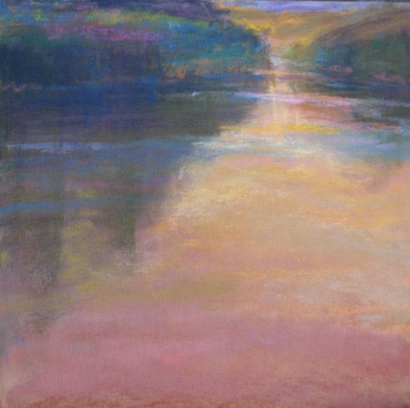
| pastel on somerset paper |

landscape paintings - Loriann Signori
Showing posts with label value painting. Show all posts
Showing posts with label value painting. Show all posts
Wednesday, March 16, 2011
more ocean waves


Sunday, February 27, 2011
value study of waves and seascapes of Tryon's
 |
| 7x10 pastel on paper |
I really love the few trips a year I spend at the sea. It is most soothing to hear the repetition of the crashing waves. During the last 2 months I often looked at the many seascapes in his book, An Ideal County. So I decided to go out on a limb and do a value study of waves in the ocean. I used an old photo as a beginning reference as I had no idea of how waves really work. To complicate it further I made a composition with three slightly unequal bands. The goal was to play with these bands and their edges to see if I could pull it off. What do you think...did I pull it off?
 |
| Tryon, moonlit sea, pastel on cardboard |
 |
| Tryon, a misty morning, pastel on cardboard |
Tuesday, February 22, 2011
value, mood and tips

The colors in the plein air painting really do show the time of day I hope to create a real mood to this painting. I can feel it. The value scale will be darker and close....small lights will peek through. Somber, bittersweet with hope.
Here are a few:
Squint (but that's always, right)
I like to use the subtractive method. On soft paper (somerset is my paper of choice) use pastel to make big shapes. With a rage and fingers I smooodge it and then with a kneaded eraser and a harder eraser I subtract lightly...make a small mistake add more pastel. It's very forgiving. Enjoy!
Tuesday, February 8, 2011
Design, color and the painting/Pierre Bonnard
 |
| 6x18 pastel on somerset |
Reducing the landscape to just value makes you think only in terms of shape and design. What does it take to make a pleasing design of positive and negative shapes? One of my favorite ways to find out is to play with one pastel and two erasers. With these I work back and forth:I make shapes, then I gradually carve out my shapes. I repeat the process till satisfied.
Long ago, Pierre Bonnard was my absolute favorite painter. He is the ultimate colorist. I was fortunate in that the Phillips Gallery in DC has an abundance of his beautiful giant, color filled paintings. I would go see them each week. These important words from the master have stayed in my mind, "Color does not add a pleasant quality to design – it reinforces it." Below are two paintings by Bonnard in the Phillips Gallery.


Bonnard's words are the same as Richard McKinley's words, "Value does the work color gets the glory." So why do we so often by pass making notans and sketches? My lesson today, slow down and enjoy the process.
Wednesday, October 27, 2010
more work with "removed grisailles"

I decided to continue the challenge. With value only I tried to create the feeling of the sun sinking below the horizon. To do this I focused on keeping the land masses dark, trying only to give light to the few places the sun's last light would touch. Making clouds with value only was the trickiest part! This will help me with the painting I began last week. My soccer field.

Tuesday, September 7, 2010
the essence, the painting on a diet


Wednesday, March 3, 2010
Dwight William Tryon, mystery and memory


10x10 pastel on gray BFK
I was down at the Freer Gallery of Art the other day, there to get my hit of Whistler, and I was led astray. It was Dwight William Tryon who captured my heart and made me go NUTS! These small images can't possibly do justice to what was there. Tryon is often considered a Tonalist, although his palette is much lighter in value.. He painted with close values, thick paint and very soft edges. He believed in "less is more" and mystery.
Later I read that he marked these words to remind himself as he worked in his studio:
“The value of memory sketches lies in the fact that so much is forgotten! In time we must learn to leave out in our finished pictures these things which we now leave out through ignorance or forgetfulness. We must learn what to sacrifice.”
Ah ha! That says it all doesn't it?
Perfect!
I have posted a recent value study. To keep the values closer I chose gray paper. My goal was to play with edge and shape. It was inspired by sketches done last summer at one of my favorite fields on Whidbey Island.
Tuesday, February 16, 2010
river at big bend/ value painting and grisaille

One of my favorite sections of the river is at big bend. It's a place where I have done many plein air paintings right here. Using those ideas I created an value painting in preparation for another bigger oil. It's important to create the mood with value alone. "Value does the work, color gets the glory." (Richard McKinley)

Then on to the grisaille.
Shapes are important when planning a painting. Only a few large shapes make a stronger painting. After making your shapes you need to carefully think about shadows and edges. How many edges do you want? (another case for less is more) For a more interesting painting don't contain your shadows let them drift and float.
This is the grisaille for the larger painting. I have been working on just this for 2 days, wiping, scratching, putting on more paint, and rubbing.More about this painting and its genesis later.
I posted two today...this is tomorrow's post..... I have so many things due for my upcoming show in May that I figured since I was on a roll........
Monday, January 18, 2010
going from small to big

I begin with notans, tiny sketches that help me understand the compositional possibilities. Insights about how the masses and values will relate on an abstract level are beginning.
The next step is a value painting. It needs to make me feel, even before color is there.


For me it, picking the value painting was a "no-brainer." the top one just flowed. The middle painting was a struggle and its idea may need to be saved for another painting and refined. At the bottom you can see the notans.
Tuesday, December 15, 2009
waiting at the light 1 and 2


So there I was in a line waiting at the light. There was a fog that made an orange- pink cottony glow. The sun was just beginning to come up between the trees. I was one my way into school. I teach 2 classes this morning. No time to stop and paint. I whip the camera from my glove compartment (it's always with me) and fling my hand out the window and snip the picture just as the light turns green.
I did the value painting at night. Now I am ready to go onto color.
Subscribe to:
Posts (Atom)