Tuesday, August 11, 2015

the power of a notan/ light your painting on fire


Want to light your painting on fire?
 I am going to give you a tip- notan. Yes, I have been taught to do notans for a long time. (And you probably have too.) I have done them in a perfunctory manner, never really getting their full worth. The lightbulb finally turned on last week.
Let me step back a moment....   Once again I traveled to Washington State to paint. I am fortunate to spend a week painting with Richard McKinley each year. He is truly the best teacher/mentor I know. I feel as if it is my check-up with the doctor. I work as his coordinator/assistant. I get to paint each day, hang out with my friends and absorb his wisdom.
This year I (finally) understood the real reason for doing the notan.

Notan is the Japanese word that translates to mean- light and dark harmony. It refers to the arrangement of light and dark that serves as the foundation for composition. With a notan you find the essence of your painting in the design.

To explain, when I began I did a small pencil sketch (top sketch). That complete, I found the major design lines and then made two more sketches with just the lines. Next, on the middle sketch you see I translated the sketch into 4 values -white, medium gray, and small places of darkest dark. (I did an extra one on the side of that) On the bottom sketch I combined the two darkest values and made the design against the white. When I moved to the bottom sketch I saw the need to change some of the placement. Notan makes you look carefully at "what is important? "How do I make my rhythm within the colors and shapes?"

Doing this small addition to your painting set up can change your world!

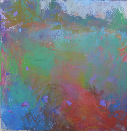
In the painting above notice how the notan allowed me to alter color so easily. Once you know your value design you can make the painting work, even when you create major changes. This scene was all green.
Let the notan be your guide.
I will post a few of the paintings and their notans for the next few days and you will see what I mean.

Tuesday, August 4, 2015

What can you get away with?

Same field. I must have ten already. This time I added the telephone poles just to play with their placement. Intentionally I placed one almost in the center, making a divide. It can be thrilling to see what you can get away with. It was my M.O. as a child and I guess i continue it still.

Monday, August 3, 2015

color relationships, distilled


 Two quickies from the same field. They are about the color relationships, distilled. That's all.

Friday, July 31, 2015

rhythm in the grasses

This new field is driving me crazy. I am transfixed. All these new works are uart paper, some with watercolor underpainting some with rubbing alcohol hard pastel underpainting. The rhythm in the Queen Anne's Lace and the Chicory is intriguing.

Thursday, July 23, 2015

field love


Field love continues. Just sticking to one theme, one field allows me to change the rest of the variables. Simple changes such as tilting the horizon line or the intensity of the underpainting make big differences.

Monday, July 20, 2015

Fingers, pastels and bridging


Fingers and pastel 
I am asked many times about how often my fingers are in the pastel. This is a tricky subject for pastelist. Many abhor all finger use. Some use fingers and tools to smooth the pastel. No absolutes for me, I simply do whatever works.
Smooshing the pastel around with your fingers can create beauty. Or sometimes you can unintentionally make dead passages- places that have lost the crystalline vibrancy of pastel. I use my fingers mostly in the bottom layers of my paintings. It is how I will move the pastel. And sometimes I "bridge."
What is bridging? When a large change in color temperature is needed your paintings can benefit from a more gradual transition. To do so you need to select colors that move the eye along the color wheel to the desired next stop. It makes a more appealing transition. For example, in this field painting, the bridge from the warmer grasses to the cool tree shadows travel from a melon color, to more pink and purple then going over to blue and green. Some colors are in the layers and some are more present.
Try it some time and see how it feels.

Sunday, July 12, 2015

new installation


I am honored to have three of my pieces chosen to be part of the art collection for the new PNC headquarters in Pittsburgh.  All three are oils. They include Island in Late Autumn (above), Rebirth(below) and Talking with Silence, study (bottom.)

Monday, July 6, 2015

Out in the field

The golden grasses of summer have returned. Lately I have been working with many layers of watercolor under painting with pastel on top. I am careful to make my watercolor darks dark enough so that I can leave them more transparent. Yay summer!!!

Thursday, June 25, 2015

Mountain Maryland Plein Air

7x8 pastel
This is an amazing event. Not only is the landscape inspiring, but the people are warm and wonderful! I love participating! Here are two paintings from my week in Cumberland, Maryland.
21x23 pastel
Now off to Nova Scotia!

Tuesday, June 23, 2015

Trying new methods

7x7 uart paper
I absolutely love summer! There is simply so much more time. I do enjoy teaching, but I must admit that when I have only one brain to wear- the painting brain- I feel my art work can take off. All I think about is painting! Hike at the lake in the morning to plein air sites, then during the heat of the day settle into the studio for a good work session.
Since I am hiking I am trying different papers and using only watercolor. Back in the studio I just put my mind back there and paint with pastel. I am exploring all different base surfaces...more about that later. 
I will also write about the Mountain Maryland Plein Air soon.

Saturday, May 30, 2015

Heilman box- tiny and wonderful!

Ooh la la, am I excited! I just received my new Heilman box in the mail! I keep going smaller with every box I buy. About 12 years ago I bought the medium box. Rather large in size it serves best in the studio. Next I moved to the backpack box, which I must admit I have 2. Each one has a different selection of brands of pastels. Now today I am the proud owner of the double sketchbox. Only 7.25x9.5x2.85. it's tiny and weighs under 5 pounds fully loaded. I placed the roll of masking tape to give you a reference point.
Last year when I saw Richard McKinley I noticed he had one. He filled it with his two Girault sets- 50 plein air and 50 neutral and friends. (of course the sticks were divided in half.) The rest of the space is filled with some of my other faves, Diane Townsend Terrages and a couple of Rembrandt's and Great Americans.
I am off to Mountain Maryland Plein Air for next week and am excited about my new box.  Since I am driving there I am bringing both backpack and sketchbox. I will let you know which is chosen and why when I return next week.
Links: Heilman boxes
           Girault pastels
           Diane Townsend pastels

Monday, May 18, 2015

going beyond what is there

48x42 oil
plein air piece, pastel with watercolor underpainting 8x8

There is no need to hunt for different locations from which to paint. Just think of Monet. Nesting in to a favorite location and knowing that place like your best friend will always be to your advantage. Let me list the reasons why.
1.You no longer are painting things. Instead you can fully involve yourself in art making.
2. When you see the same place day after day you become far more sensitive to its color changes.
3. Since you are no longer painting things, instead you paint shapes you feel freer to move them.
4. When a place is ingrained in your head you no longer even need to be there. This is a location I have painted on location and in the studio for about 12 years. I will never exhaust its possibilities.
Above (top) is a studio piece done without reference..of course, except the information stored in my head.
Above (under) is a recent plein air piece. One of my many morning vitamins, it's not meant for selling, just information gathering.

Friday, May 8, 2015

maryland public TV pop up gallery


Last night the Maryland Public TV displayed a small pop-up gallery of my work. What a nice surprise!  I found out when I received an email to my website... a new collector!
 Here is the link if you want to see it.http://video.mpt.tv/video/2365484282/
It truly is just a notation in the program...still I am delighted!

Tuesday, May 5, 2015

April demo at the gallery

finished painting with pastel
watercolor underpainting for demo
This is for all of the folks who attended my demonstration on April 11th. Thank you! This painting was done completely from memory. The bottom photo is what the attendees saw and the top is the finished piece.
Tip- The most important thing to remember when doing a watercolor underpainting is to try to get your values correct. If you don't the watercolor will need to be covered in order for the painting to read correctly.

Friday, May 1, 2015

order from chaos


pastel with watercolor underpainting
Now that my show and residency are finished, my brain and time has been freed up considerably. This just in time for plein air painting's most gorgeous weather of the year. Yay!
Sometimes I think my better plein air pieces come when the subject is total chaos. That means I have to select and create a kind of order. With the thick woods, filled with underbrush and a flowered forest floor the opportunities are limitless. I simply paint color shapes.
PS Thank you everyone for making the show such a great success. To all the folks that put their names on a list for the next workshop- I will get back to you soon! In the meantime- keep painting!!!

Sunday, April 19, 2015

Washington Post art critic reviews my show


 From Post Art critic Mark Jenkins

Moving toward the transcendental

In some of the landscapes in “A Quiet Suspension of Time,” Loriann Signori depicts specific places, occasionally even dramatic ones. She is a plein air painter, after all. But this Gallery B show reveals that the local artist is walking away from the specific and toward the transcendental. The loveliest pictures have an otherworldly glow.
Signori calls herself “a painter of luminosity,” which puts her in the lineage of J.M.W. Turner, the 19th-century British prodigy who moved from realism to a sort of impressionism. Where Turner gave oils the spontaneity of watercolors, Signori’s other medium is pastel. Indeed, most of the works in this selection are pastels, often rendered in a narrow chromatic range in the quest for what the artist calls “color vibration.” Narrow distinctions between pinks, reds and oranges yield an enchanted haze.
Remarkably, the artist has managed to transfer this method to oil. Such serene yet vivid paintings as “Diva in Violet and Red” approach the softness, brightness and grainy complexity of pastels. While Signori hasn’t entirely abandoned trees, hills and sky, her newer work is increasingly, and beguilingly, unnaturalistic.

Link to the Washington Post article

Wednesday, April 15, 2015

the frame is part of the whole


oil on linen
We work so hard on our paintings. We torture ourselves to do the best we can, not wanting to accept second best..... but why do we not spend the time and money to choose the perfect frame for it?

Money can be a big issue when we consider framing, but it's money well spent. A frame can either make or break your presentation. For this show I spent what I consider an amazing amount of money on frames. I chose my special paintings to get the full diva treatment. Rather than use a simple floater frame for these, I made the frame match the specialness of the painting. It required over an hour to work with my framer to just figure out just one frame. And it really made a difference. They paintings I spent the most money and time looked best and sold easily.

The painting you see above is one my favorites from this show. I worked with my framer to get it just right. The dark frame next to the painting seemed to suffocate it. I tried everything including floating it to leave the edges present. Then I found another thin violet grey frame and saw that was the ticket! My wonderful framer built it inside the black green frame. It was not a frame I could have imaged, but it worked.

Think about it....what do you want your babies wearing when they go out?
pastel in recessed mat with gold frame

Thursday, April 2, 2015

my new show advertised in the Washington Post

Washington Post:

Going Out Guide for Montgomery County, April 2-8, 2015

April 1
“A Quiet Suspension of Time” An exhibition of plein-air landscape paintings by Loriann Signori continues through April 25. Gallery B, 7700 Wisconsin Ave., Suite E,
More info just for you:
*April 4, Saturday -pre-opening party with live music-   4-7pm
*April 10, Friday- gallery reception-  6-9pm
*April 11- artist talk and demo, 3:00-4:00
*April 19, free children's class, 12:30-1:30
*April 25, free adult class, 2:00-3:00

Thursday, March 26, 2015

strategy for naming paintings


moving towards the light, pastel

Naming paintings is something artists either dread or love.  I have chosen to embrace it, but that's easy for me because I have a strategy. I will share it with you.

Oftentimes a painting speaks her name while I am working. Sometimes not. In that case I rely on "the notebook." I keep a tiny spiral bound notebook with me almost always. If I don't have the notebook I write ideas on scraps of paper and pocket them. Since I live in an urban area the time spent waiting at traffic lights often can be my most productive mind-wander moment. Therefore the notebook is always in the car. In addition I am an avid reader. Just absorbing writer and poet's delicious words can inspire new titles. Life experiences inspire titles. For example, many of the paintings for my next show, were painted during the time of my Daddio's process of leaving us. Two of the paintings I did in California describe the process- time to say goodbye (below) and moving towards the light. (above) I didn't even have to think about those names they presented themselves. When I paint tree groups they remind me of people and thus we have names like- silver divas (below). When the painting has meaning it will tell you.


Naming painting is a personal thing. How do you feel about it?

BTW Mark your calendars- If you are in the area, be sure to come to my next solo show, a quiet suspension of time- paintings by Loriann Signori. The opening is on Friday April 10, 6-9. But you are also invited to my pre-opening party for a sneak peak on Saturday April 4, 4-7pm. The show is at Gallery B in Bethesda MD. I will be there April 1-25 working at my easel (12-6) Come and visit sometime. I would love to meet my blogger friends!

time to say goodbye, pastel


silver divas, pastel

Friday, March 20, 2015

taking a chance


pastel on gessoed marble dust/oil underneath 36x42
It's framing time. Normally I frame my small paintings, but anything large or unusual I have my wonderful framer Bosco do it. I decided long ago that I realize I could save money doing it all myself, but it's about time and quality. I don't have the time (since I teach part time) nor do I have the knowledge to do certain paintings justice. That's the long way of saying I am taking a chance framing this one. It seems to me that the drips and raw edges are part of the whole, part of the thinking. Therefore I am keeping them in. (ignore the black on the right side..warp of camera on this large piece.) I am having Bosco deep shadow box it leaving all the "unfinished" exposed.

Monday, March 16, 2015

Rothko trees and upcoming show

oil on linen 36x36
I am finishing my paintings for the upcoming show at Gallery B in Bethesda. It will be up April 1-25th.  I will have my easel set up at the gallery and working there Wednesday through Saturday 12-6. There will a couple of free classes as well. Sign up for my newsletter and I will be sending out the specifics soon. (Link for my website.) Or, of course, you can email me and I will snail mail the show postcard.
The inspiration for this painting was a plein air painting I did this autumn. Patience and glazed layers was the way this one was created. I want to do the same layered opalescence. It's funny, my wonderful framer Bosco said to me that I was continually changing in this body of work. The only thing I could think was I kept seeking the best way to "feel." I'll still keep looking.

Monday, March 9, 2015

Interpretive painter? what do you think?

24x24 oil on wood
I was delighted that Judson's Art Outfitters choose to write about me on their blog! Last year, in Sedona, I met Carl Judson when he honored me with the Alcantara Paint Out Award. Carl is an avid plein painter himself and travels all over to different plein air events, so it means a lot that he chose my work.  Thanks Carl!

I found it interesting that I was labeled an "interpretive plein air painter" in the article about my work. Here's the Link. It's funny, I do realize, when I am at the plein air competitions, that my work does not look like the other work. I don't intentionally try to make this happen. Yet, I have always felt I was distilling and seeking the essence of the landscape. I guess that is interpreting.
When on location I try to feel my place, thus I prefer to be a "frequent flyer" and simply return to the same places time and time again.  I guess it is not really about the place. Or the place is so well known to me I can discard the "place" and paint. Does that make sense? Maybe I am an odd match for plein air competitions, but I just LOVE to paint on location (as well as in the studio.) What do you think? How do you see/paint?

Wednesday, March 4, 2015

Drawing 365: Tips and Techniques to Build Your Confidence and Skills.

Here are two pages from Katherine Tyrrell's excellent book Drawing 365: Tips and Techniques to Build Your Confidence and Skills. The book has been printed by North Light Books in the States. I am honored to have many pastel paintings included. (Thanks Katherine!) It's a very helpful book filled with excellent tips and beautiful images, must to have in your collection. You can order it with this link on Amazon.
I have posted two pages with my work, both are plein air pieces.
P.S. The Asian printed book (Page One Publishing) is titled 365Hints and Tips for Drawing and Sketching.
Here is a link to Parka Blog where you will find an in depth review.

Saturday, February 28, 2015

eternity

eternity, pastel
I continue to work on pieces for my next show opening April 1st. I read poetry, and in the past months I have feasted on a banquet of poetry, all of it influencing my work. So I share a recent main course. Enjoy.


All things pass
A sunrise does not last all morning
All things pass
A cloudburst does not last all day
All things pass
Nor a sunset all night
All things pass
What always changes?

Earth...sky...thunder...
mountain...water...
wind...fire...lake

These change
And if these do not last

Do man's visions last?
Do man's illusions?

Take things as they come

All things pass

Lao-Tzu

Monday, February 16, 2015

a quiet suspension of time


The concept for my next show began with this painting- which I just completed. "A quiet suspension of time"- that moment after dusk when the heaviness (and sometimes the lightness) of life whispers to us with her husky voice.
It's weird I can't seem to get a good photo of the painting and I was hoping to have her represent the show in the PR. She defies photography.