Monday, November 30, 2009

morning's crisp air


8x8 pastel on watercolor on wallis (actually painted on Sunday)
Focus -sky
I began with defining the color and value of the light in the distant sky and how it will be reflected in the water. The sky is the lightest value, followed by the light reflection in the water.
There was a heavy frost coating the grass.  Hundreds of Canadian geese were floating on the water. Winter's coming.

Sunday, November 29, 2009

windswept lands


about 18x24 pastel on BFK
Still working on the field, but this time I took a whole different view. Low horizon- something out of my comfort range. I tried to capture the windy autumn into winter spirit that has been present for days now. Clouds have always stymied me. I guess it, once again, is all about value. Hmmmmm, am I sounding redundant?

Saturday, November 28, 2009

field/experiment with materials


8x10 pastel on archival fore core
Yes. that's right this was done on a left over piece of archival foam core. It was soft..felt similar to the BFK I have been using. I must say it worked completely differently. Glossy and slippery and it sure wouldn't take a lot of pastel. I had to jam it into the surface with constant rubbing. An experiment. Felt more like  etching.

After my frustration with the value study I coated the board with lascaux pastel primer. The board would not take water so using only my notes and my memory I did a color study with pastel. This is all preparatory work for some bigger field paintings.

I think I have to start alternating my plein air painting sessions with more memory work.

The only thing I learned from all this is that "all that glitters is not gold;" meaning archival foam core will not substitute good paper:-)

Friday, November 27, 2009

autumn's last breath


8x8 pastel and watercolor on Uart
The cold winds were whipping across the lake, which meant I had to hold onto my easel and forgo the umbrella. My goal was to use color to make the feel of autumn's ending.

Thursday, November 26, 2009

whispered moment


8x8 pastel on watercolor underpainting, thickened by fog

Just knowing there would be a thick fog in the morning made it difficult to sleep.  (I love fog.)
Painting fog is all about value relationships. Like bookends, choose your darkest dark and lightest light before doing anything else. The watercolor was easy, it flowed on the paper. But the added moisture in the air made the pastel chunky. I had to go to the car several times to dry the surface. The fog continued to be thick so time was not an issue.
Happy Thanksgiving everyone..now I will go bake a pie.

Wednesday, November 25, 2009

through my pours


9x9 pastel on watercolor, Uart paper
This one was painted early Tuesday morning on location. It was raining lightly  you could feel the atmosphere through your pours. "Grey" days are the best!
It was too wet to add pastel so needed to do that in the studio. With this painting the goal was to get the essence with the barest minimum of strokes.

Tuesday, November 24, 2009

Lone Tree/ experiments with value/color and mood


12 x12 pastel  on BFK

I am determined to explore mood through this field series. On the bottom is another value painting (similar to November 18th posting) and on top is the color I chose to paint over what now worked as a grisaille.  I lost my focus and expanded my value and color range. It was then that the mood of the grisaille was lost.   I guess that is why the Tonalist paintings have such mood. Limited change in value. Experience, make mistakes and explore that is the path to constant learning.

There is something about color I sometimes can't resist. I will do this composition again and limit my value more.
What is your experience with mood/value/color?

Monday, November 23, 2009

tangerine sky


Pastel on watercolor, watercolor underpainting below

The air was cold and the water was slightly warmish....thus the beautiful fog. The tangerine sky set nicely off of the blueish fog. I must admit I just enjoyed myself with this one. Just painting for the pure joy of painting.

Sunday, November 22, 2009

Towards the Sea


12x12 pastel on paper
I blogged this one (bottom, value painting) last night. I was thinking about soft and hard edges.  I quieted my mark in the distance and allowed it a little more activity in the foreground; still trying to keep this soft and moody. Last night in my dreams I added paint and pastel. So, of course, upon awakening I tried to paint it "for real." I sprayed it with my wonderful Spectra-Fix and began with paint.

Yesterday Paul walked the length of the street with his crutches (me by his side.) He is starting to get his pep back. Yay! thank you everyone for all your well wishes!

Saturday, November 21, 2009

mark making/ influenced by john marin


16x20 watercolor and pastel on Uart paper
I had the most fun with the watercolor underpainting, I even wonder if I should have stopped then, before my fingers were freezing and stumbling over the paper. (It takes awhile before getting your "frozen painting legs."I feel like a total whimp now.) I feel the underpainting has a freshness the other doesn't. After I finished the watercolor I noticed that it felt so John  Marin-esque. Why I ask???? The one thing I remember about John Marin is that he believed he had to know a place intimately before he could paint it. I am in  complete and total agreement with him.
Today  was thinking about marks- why and how we choose. The bigger paper allowed the marks to get bigger and more expressive. I also wonder if our marks reflect emotional state as well as reaction to the subject. Any thoughts on that one painters and non- painters?

Friday, November 20, 2009

straddling abstract


How much to leave in and how much to take out... that is the question. Today I started with a very abstract underpainting and than snuck up on it, little by little till you can read what it is yet straddles abstract.

Thursday, November 19, 2009

How much do you need?


My question today..how much can I take out and still leave enough?? Strip it down to the most fundamental aspects of the landscape. Can it still say landscape? Have a mood?
Lots of doctor, PT and tests today...busy. Hopefully I will get more done tonight. Paul is beginning to have some independence. Yay!

Wednesday, November 18, 2009

back to values.... tree on the hill


Back to values. Before beginning bigger work (or any work for that matter) it is always good to do a value sketch. Usually I make a small notan rather than a full blown value study. But recently I have really been enjoying painting in one value.  The reasons for making these are numerous, most important and most obvious is to determine the value relationships between colors in the landscape. After doing this it is easy to become freed of "local color." Meanwhile I have learned that more than color, value makes the mood.
Try making one... just for the fun of it.  One hint remember to SQUINT. Value doesn't separate things...we do.

This one comes from a small painting I did this summer. The full color painting (below) is 5x5 and this value painting is 19x22.

Tuesday, November 17, 2009

chroma equals vibration/ autumn trees


8x8 watercolor and pastel on old Wallis paper

Another quick hour for work while Paul sleeps. This time I was painting it in my head all evening before heading out this morning. This scene lasts just moments so a lot of study needs to go into understanding what is important and how.  I painted like a madwoman on this one. To me, this finally found success. The right chroma (not always the correct hue)  is very important in the quest for the vibration.

Monday, November 16, 2009

vibration between colors


8x 8 pastel on watercolor Uart paper

Today's focus- paint the vibration, the sensation between the colors.  That doesn't mean the exact colors, but instead the feeling they make when they dance together. I had only one hour to paint while Paul slept. Time limits can be good too.

Update on Paul: yesterday he spent the day in the hospital (possible blood clot, yipes!). He is home now, but the most time I can spend away is one hour. Lucky part, my studio is right next to the bedroom and I can keep a good eye on him.

Saturday, November 14, 2009

third version- square


The next format to try was the square. I saved the best format for last.  The mood is there...now  I will think about color.

On another separate note Paul is now home, hobbling around with my help. They say it is 4 weeks till full movement. He is on crutches and can get up and down stairs. Will time go quickly? or slowly? hmmmm. Thanks for all your well wishes.

Till tomorrow!

Friday, November 13, 2009

format change/vertical version


I decided I would do an experiment. Same field, same mysterious goal, new format. The only changes I made were necessary placement changes that were required to make the format work. What does the vertical say now?
Now off to the hospital...thank you again for all the well wishes and cards.
Tomorrow, same view in  a square.

Thursday, November 12, 2009

mystery in value


With limited time in the studio, I decided a value/ mystery study was in order. It always amazes me that value has so much power.
Now I am off to the hospital for the whole day. Thank you everyone for your well wishes. Paul is doing well and receives his first physical therapy today. You are all GREAT!!!!!
Till tomorrow.

Wednesday, November 11, 2009

choice of format


Format- why do we choose what we choose? In the comments of my last post Sam noted that a vertical has more depth and suggests more sense of place. Marianne shared that a 2:1 ratio has been favored by many of her collectors and Doug suggests that the subject matter dictates the format.  Check out their blogs to read more of their interesting ideas. Richard McKinley, the pastel god, talks and writes about it often. Here is a link to one of his discussions about format, the painters window, on his blog- here.
I agree with all of them and would like to add one more thought. For me, choice of format is a decision based in emotion and the desire to portray a concept.  A simple view: a rectangle is calming and a vertical is dynamic (think about some of those amazing Japanese vertical prints).
Long ago when completing my MFA I wrote my thesis on the idea of format and its power. I will have to try to dig that document up some day and see what I thought back then.  Throughout my painting career my favorite format has been a square. I like the tension that is inherent in the square. It is neither rectangle nor vertical. It is a challenging format to use, but very rewarding. You the painter decides.

Look at the 4 paintings above, a long horizontal, a square , a long vertical and a standard rectangle. What do you think? How does each make you feel or work for you?

On another note: Today is not a painting day. Instead I sit in the hospital waiting room nervously waiting for news of my husband's surgery He had hip replacement surgery this morning. A man, still in his 40s, Paul's genetic predisposition and his years of long distance running and soccer has torn up both his hips. Send some good thoughts for a speedy recovery for my man.

Tuesday, November 10, 2009

uncompleted dreams


Why are verticals exciting?  It seems that the one vertical I had in the show could have sold at least 4 times.....why????? What is it about verticals? Do you know??? I am not sure. So this morning I left the house knowing I would paint a vertical. What do you think?

Monday, November 9, 2009

fog and the triad of secondaries


9x9 pastel on watercolor
This morning's light fog and heavy atmosphere was awesome. Dominant color-violet. A triad of secondary colors- violet, orange and green, you just can't go wrong with this combination.

Sunday, November 8, 2009

Plum comes out to play


Lake Needwood has a special glow right now. What's left to the leaves shows as a deep plum and burnt sienna making it a beautiful combination with the water of Needwood.

Last night's opening was fun thanks to all of my very supportive friends and collectors. I met many new people as well.
I think now I will exhale and then set a new priority list.

Friday, November 6, 2009

man vs nature


Today is hanging day for the show. Needless to say I am a  bit frantic. Two main pieces (including the main image represented on the postcard invitation) are not ready due to different snafus. So I sit a Starbucks waiting for them to be prepared. Here is  my artist statement prepared especially for this show.


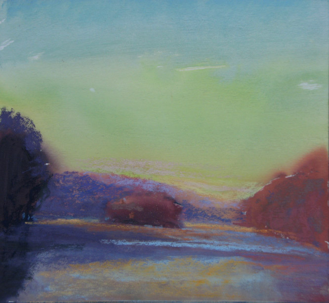
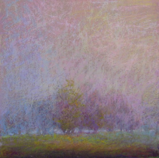
"I have never thought of myself as an activist or environmentalist, simply as an artist who loves the outdoors.  This has changed since that one day when the bulldozers and big machines arrived in "my field." That is when I learned approximately 800 acres of forest, including large tracts of mature forest, and nearly 10 miles of streams are being destroyed to build the 18.8 mile, 6-lane toll road called the ICC (or Inter_County Connector.) Since that time I vowed to paint these fields, which I named "the forgotten fields," and record the beauty that will disappear within months.

As a painter I am drawn to the wonderful "chaos" that is a wild field.  The sweetest light of the day, the magic hours of dawn and dusk, are my chosen times to paint. Therefore each day, regardless of the weather, I tie on my hiking boots and head to the fields. I paint from life so that I can feel the poetry that is light.  Sometimes I use my smaller plein air paintings to allow me to create larger studio works.  When beginning a painting I first set the tone and value with thin washes of watercolor or oil. next I use my pastel as a glazing medium, layering one color on top of another in a translucent fashion to heighten the vibration between colors and the feeling of light. Subtle play between warm and cool colors, transparent and opague passages intrigue me.

Sublime was a term that cam to mind when painting the fields: the elevating of this classic/common northeast landscape to the greatness which it deserves. that was my mission. A mission I accepted with the love and seriousness it required.

So please take a moment and savor the timeless, bittersweet feeling of something special lost forever.

Thursday, November 5, 2009

smoke on the water


8x8 pastel and watercolor on uart
I was given a second try to capture the idea of light fog rising off the water. Yesterday's looked more like ice...this time it does look more like vapor. To create the vapor like effect I used many colors of the same value intertwined. Maybe I will try it next with this painting as a reference.
I have been very busy getting ready for my show that opens on Saturday night- Man vs. Nature. (Please come if you can.) This show documents the beauty we are losing due to the construction of the new 6 lane toll road the inter-county connector, otherwise known as the ICC. It's been a very emotional time for me. It's amazing how this kind of work can be so upsetting. Beauty lost forever.

Wednesday, November 4, 2009

searching for the illusion of mystery


about 8 x 15
Excitement rules when there is fog predicted!
This morning a light fog lay on top of low lying areas and water....oh la la! Fog and its cousins, mist and haze, are wonderful things: they evoke mystery. The  underpainting was far more successful on this account: subtle tonal shifts with delicate edges. I think I became too "sharp" in the pastel version. As the haze lifted I painted portions of the changes. Bad move. While it is not a "bad" painting I think the underpainting is better. Less is more once again wins.
I think I will rework it when i am back in the studio.

Tuesday, November 3, 2009

three little piggies


8x8 pastel and watercolor on Uart paper
Articulate your color harmony. This blue skies and long shadows demanded a dynamic complementary color harmony: blue and orange. When choosing blue that meant I leaned all the violet shadows toward the bluer end of the spectrum. The fence in the distance  appears blue. The sky has the thickest and highest value paint and pastel than any other place. I tried to keep the shadows transparent.

This beautiful field, next to Lake Needwood is destined for sacrifice. Soon they will build 12 new homes, this, near the ICC. Sad. As I was painting I kept thinking of the three little piggies (the trees)  and the wolf  (the ICC.)

Monday, November 2, 2009

pink veil

This one is in progress. It's idea sprouted from all the recent lake studies. It's big, about 18x27. Layering the watercolor was fun with my new 2" brush. Materials don't make the painter..but boy, oh boy it's heaven with a 2 inch thick juicy brush full of pigment.

Sunday, November 1, 2009

a world of plum and sienna


Oh what a difference a day makes! After a night of rain the golden and pink leaves have disappeared. In the rain this morning the world appeared to be a mix of plum and sienna. I found a little overhang so that I could paint and not be soaked:-) In this weather the values are so close with just small shifts in temperature. I do love these rainy day landscapes and autumn is pure magic.