Thursday, March 31, 2011

reworking a plein air piece

11x14 pastel on marble dust board
Uncle Harold's field is where I worked last Spring. The light changed so fast therefore I adapted by doing many  pastels, most of which remained unfinished. I found this one when I was cleaning my studio and decided to give it a second chance. For two days I have tried to strengthen the focal point and  make it easier to travel through the painting. I focused on using my pastel I the ways that I love. A mixture of dancing marks, smooging and lots of fixative made a new painting. Better or worse?
step 1 plein air
step 2

Wednesday, March 30, 2011

simultaneous contrast, unlocking the key to color

12x24 oil on wood
As I have talked about before, simultaneous contrast is the key. It is the key to unlocking color, its beauty and its relationships.
So as I see it, that to me brings about 2 choices about glow.  In the Tonalist tradition the darks make the lights glow and it works beautifully. Without the darks the lights are dull since they have no contrast.

Now, is there another way?  The use of neutrals also makes colors take on new attributes. In this painting that is my strategy. Will it work? After about a month of layers I am at this point. Still I will increase the "grayness" of the clouds.
Sunsets are very hard to paint...they so easily become hokey, postcard like images. I am hoping to by-pass that.

And now for the studio update recently labeled "project hope"by Mae(my second Mom):
Another contractor will come this evening to talk about possible costs for the building of a new studio.
My Dad has added all kinds of important facts to consider.
Many artist friends continue to email me and comment with suggestions.
I really do appreciate everyone's help.

Tuesday, March 29, 2011

the color of light and the importance of painting plein air

5x10 pastel on watercolor on Uart

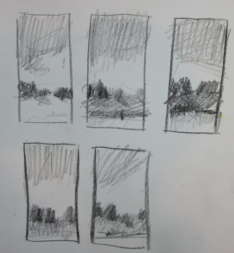
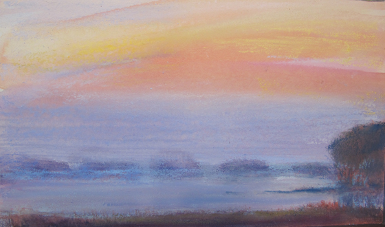
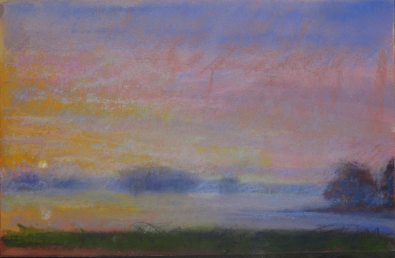
After completing my re-creation of the Needwood Pond image from memory (yesterday's post), I knew that I had to go to the site and paint plein air. Painting outdoors is a whole different can of worms compared to studio painting. Outdoors it is so easy to get wrapped up in what is there, instead of what is the essence of what you are painting. You can easily become distracted by details. (I suppose that is why memory painting is so essential.)  I can not stress enough that outdoor painting is very important. It helps build an understanding of landscape and light that you will NEVER get from a photograph. So here are some tips.
When working outdoors remember:
1. Study the landscape you have chosen to paint. Do not even pick up a pencil. Study.
2. Talk to yourself. Articulate why you are painting this particular landscape. Concept is key.
3. Next think if you were just going to memorize what would you need to know? Know deep inside what it is
4. Identify the color of the light. Notice how it changes the color of everything. This light was very yellow...a bright yellow, veering towards white. Did I want white? No? So I leaned more yellow.
5. After you have studied and made sketches or 3 value notans, only then begin. Stick to your value map.
6. Look more at the painting than the scene. Trust that you know the scene. Look to confirm.
7. Always remember it is about the concept/feeling and good planning pays off in the end.

Thank you friends for all the studio building information I have received- keep it coming!
We are looking at the financial aspects. The main two choices are:
Do we combine both  north facing- master bedroom (my present studio is the old master bedroom) and guest bedroom to make a larger studio...which I will outgrow in about 5 years? Yes, don't worry, we do have a bedroom on the south side of the house. (cheaper)
Or do we build a studio (hamster house) in the back? More expensive.
If you have built your own let me know. Thanks Sam for all your in depth info.

Monday, March 28, 2011

abstract design and concept

about 12x6 pastel on Uart


I said that I would write more about reducing shape and simplifying.
Reducing and simplifying is not just about eliminating detail (although I will talk more about that later) it's much bigger than that.  To work out my ideas I  revisited the Friday's painting in which I lost my focus.
Why did it not work? The main reason was because the concept (a tumultuous Spring sky and the way the light played on the landscape) was not supported by a good abstract design. Good abstract design which appears in strong compositions is the key upon which all good paintings are built. Creating a notan helps and I hate to admit it's a step I skipped that Friday afternoon. So now I have redone it.
Just using my memory I created new sketches and  grisaille. With a limited palette I made a new pastel with a better design and feel.  Now I think I will go back on site and try it again in plein air.

Sunday, March 27, 2011

reducing shapes, less is more

9x9 pastel and watercolor
The details in anything often times complete the presence, but it is the idea or feeling that makes it. As Paul and I have been "hunting" for a possible new home we notice it over and over. It is the same with paintings. More idea and details just where you want the viewer to look...that's it. With the idea of simplifying the land masses into readable yet not "tell all tabloid type, information-filled, forms" I tried to convey more with less. I feel this is my direction.  There is much power in the mystery of that direction, still with the color I love.
PS I hope to be building a new studio soon. Have you built your own studio? If so please contact me and tell me more!


Saturday, March 26, 2011

sandpaper and me

6x6 oil on panel

This one has been through a lot already. As I try to find my way with it Paul comes in the studio and says, "That's nice, what is it?" Well that's when the sandpaper came out and met the wet freshly glazed panel.

Egad! So please don't ask me what it is. It may be done (for now) or it may be abandoned. One thing I can say is- I do like sandpaper.

The Tryon seascapes continue to inspire me. It's just now they have mixed with the peregrine moon.
For a treat visit the Tryon slide show from the Freer.

Friday, March 25, 2011

losing focus and decision making

cropped 5x10

10x10 pastel and watercolor on Uart (original size)
It's always good to show a total dog so that I can speak to my own learning process. This began as a plein air sky study.
Same painting, above has the crop, below is the original. It is amazing to me how much it changes. The top version is all about the color of the day and the way the sky moves. The square format of the bottom one changes the tension (which doesn't work) and the red buds on the maple in front adds a whole different dynamic. I could tear it apart forever instead I will summarize. (Actually neither painting works.)
Two good lessons-
*Your format is your first important decision, don't blow it here!
*When you decide your concept- stick to it. I have two divas in the bottom one and they are fighting. If sky is the focus don't let the water or trees get the spot light- divided focus is BAD.

To see some excellent use of cropping (something I rarely do, but maybe should investigate more), visit Barbara Newton's blog post"the cropping queen". After you visit the "cropping queen post" make sure to see the follow up (newer) posts. If you have never visited her site you are in for a real treat!

So now that I am completely warmed up, back to painting.

Thursday, March 24, 2011

soft pinks and red of Springtime

A Spring rainy morning is touched by soft reds and pinks. They show in the distance as more violet and in the foreground as an orange pink. Soft is the key word.(although a slight bit of exaggeration goes a long way to create the distance necessary) Ah! It is sooooo good to be back outside!

Wednesday, March 23, 2011

the power of contrast and cleaning the box

 The power of contrast can not be ignored. Each color looks different depending upon the colors adjacent. Remember, simultaneous contrast is just as important in your box as it is on your painting, it affects your choices. The neutralized orange (with wrapper) looks much more appealing next to the grays rather than the colors with more chroma. That is why when I organize my pastel box I have two rows of magnificent grays. They make the chroma in the painting work.

Here is my cleaned box. Late yesterday I cleaned and organized my box ready for more plein air work. My choice in boxes is the Heilman backpack box- small and sturdy.
Below see one of my cleaning methods- a large piece of screen wrapped over the box. With the  screen in place I can vacuum the box and my precious pastels are still protected!

Tuesday, March 22, 2011

morning moonset

5x5 pastel on somerset
I have been having fun doing moon pastel paintings as my warm-ups. Trying different combinations of color, times and compositions. Sometimes we just have to have a little fun, eh?

Monday, March 21, 2011

peregrine moon..super moon

5x10 pastel and watercolor on Uart
The "super moon", the largest moon since 1993 played a starring role in the sky on Saturday night. We were playing cards at our good friend/neighbor's home and we left the game to go watch the moon. Large, glowing, hanging it took over the sky.  The colors of the sky changed each time I looked and memorized. Later in the eve it was violet, earlier there was an orange glow. You will see more of these as I process the experience in pastel...and maybe later paint.
Of course, I didn't take photos..so the street may need work if this grows to a painting. Memory will be my tool.

Saturday, March 19, 2011

new paper trial- colorfix suede

Another pastel possibility. I am experimenting with the intensity of the underpainting and what I can do with smoothing and texture. While I experiment for the fun of it I also create them as explorations for later oils. While head thinking an oil I want to know the possibilities of new underpainting.  In a way the pastel is a shortcut as it would take much longer to do the research with oil.
In addition this is a new paper. The people at Dakota Pastels sent me a piece of Colourfix Suede.  I like this paper and I am really fussy about paper. It takes the watercolor quite well and the taped paper didn't buckle a bit. In addition after the watercolor had dried it was easy to smooth the pastel with a finger.  A perfect mix of smooth and  rough the suede has  enough texture so that the pastel will rest on top and vibrate with the underpainting.
Here is what Dakota says,

NEW! ART SPECTRUM COLOURFIX SUEDE
Art Spectrum has added a new line of paper with a less abrasive surface to its family of archival quality pastel papers. The surface of Colourfix Suede is smoother or softer to the touch than the original Colourfix, so is gentler on fingers and tools, yet still holds layers of pastel. It works particularly well with PanPastel and Sofft Tools. The Suede is produced on a heavier weight (500gm) hot press watercolor paper for more rigidity. The surface coating also goes to the edge of the paper to help distinguish it from the original. Colourfix is available in eight colors - six new colors, black and white. The Rainbow Packs have the six colors plus two each of black and white.
We offer a sampler containing one 9 x 12" sheet of each of the 8 colors.
It's on sale at Dakota. Here is the link.

Friday, March 18, 2011

memory of an early morning March sky

5x11 pastel and watercolor Uart
So I broke my own rule. I didn't wait 12 hours. This morning, on my early morning walk the sky was inspirational. With nothing but my brain I tried to remember the differences of the sky in this breezy March morning. What makes it so special? I let it percolate for 6 hours then I tried to not rely on just color, but have value rule. (maybe I need more work on that.)
I am falling in love with skies.

Thursday, March 17, 2011

Sam sparked an idea

1st layer
underpainting
Full spectrum and beautiful grays- that's what Sam, a Maine native, said. (Check out her blog here.) 
This is her comment on yesterday's post, "There's something about the shore in that part of the world that's less about color and all about value. These grays are full-spectrum and beautiful." So it didn't take long to think about working to glaze those full- spectrum grays. Above see the underpainting and the first layer of thin glaze. Seeing the beauty of grays is something Whistler did oh so well. With his thin "sauces" he made beauty and light with gray. So I look to him.... as I so frequently do.
Nocturne in Blue and Silver, James McNeil Whistler

Wednesday, March 16, 2011

more ocean waves

pastel on somerset paper
When I am stuck on a painting, there is something very soothing about doing a value study.  My best friend Leah sent me photos of her Nova Scotia beaches. This is Clam Harbour. I really want to get to the beach now. But instead I will return to the struggle of painting.

Tuesday, March 15, 2011

a new treasure

New York Central Art Supply has a little treasure.... a spiral bought sketchbook filled with the beautiful Somerset paper I love. Somerset paper is 100% cotton with a slightly rough surface. It blends pastels beautifully.  Only New York Central Art Supply makes these little sketchbooks. Ask for a Wolf Kahn Pastel Somerset spiral sketch book. They are great for my small memory sketches. Think of it, a sketchbook with great paper!

Monday, March 14, 2011

symbolic crossroads and the hamster wheel

6x9 pastel and watercolor on Uart
This is one for my studies for the long oil. Each time I try different ways to get the vision in my head I discover new possibilities. I have found that doing my study paintings in pastel makes painting the oil easier. I play with different underpaintings and color possibilities. This possibility was taken from last night's sunset on the field. Granted it is a soccer field and has no water, but that didn't matter.

As I thought about the symbolic crossroads I have reached in my life I needed to ponder more about the differences during this "time away from life" that I have experienced for the last 3 months. When immersed in my regular life I was constantly processing and multi-tasking. During this time of recovery my time slowed down to a wonderful standstill. It was as if I was at Walden Pond, alone. There were no real expectations of me, except to heal. Very different from life, eh? I lived in my head for the first month and painted from my bed. My ideas grew because they had NO competition for my attention.  I have learned to trust my head and crave silence. I want less activities staking claim to my mind. Yet, still I am not a hermit, and truly love my husband, family and friends. As I prepare to enter my life again I wonder how do I create that environment in this crazy hamster wheel I call life? That is the challenge we all face each day. But, for me, having a glimpse of sanity makes me want more.

Sunday, March 13, 2011

crossroads

6x9 pastel and watercolor on Uart
I guess this is as literal as it is symbolic. It is a plein air painting of the crossroads near Lake Needwood. As I drove (yes drove!) home after painting I pondered. Why did I drive all the way to Lake Needwood, yet not paint it? Instead what excited me was the light stretching across a crossroads. I couldn't help but think it was more symbolic. I will think about it and make my thoughts more concise for tomorrow's post.

Saturday, March 12, 2011

back outside, memory paintings and Daddio

4x8 pastel and watercolor on Uart
Yay! I finally drove my car and went plein air painting. It was sunset when I finally arrived at one my favorite spots. Not a lot of time to plan, but I know this view. so the plan was in my head. I must say that after all of my memory work I worked differently. So much more of my time was spent looking and very little painting. It's funny with just this small sketch I could easily do a huge painting...so much is in the experience. I think I should now do a painting without the painting.
It makes me realize that memory painting has to be a major part of what I do.

This painting is dedicated to a very special person- my Daddio. Happy Birthday! I wish I could be there...I hope it's wonderful!

Friday, March 11, 2011

experimenting with underpainting

12x24 oil on wood
6x6 oil on wood
I have this idea, yet I haven't a clue how to do it. Somehow I think the secret lies in the underpainting. That leads me to my experimenting. I am planning, rubbing, scraping, scratching. Both these underpaintings are in step two of setting up the colors. Both are on wood...if I don't like it I can sand it off. I want my work to return to the looser nature of my pastels.  To feel light and freedom
On another note, it has been so long since I have been in the field, but the good news is here......starting tomorrow I am able to drive again!!!!! YAY! I can't lift my plein air stuff on my back...yet. but I know plenty of places that I can paint right near the car! I am so excited I can cry! This has been a LONG trip and to tell you the truth it has changed my life for the better. You wonder how can having most of your right lung removed change for the better???? Well, I slowed down and have learned to appreciate differently. I learned to ask for help (something that was taboo.) I learned to trust my painting head in a new way when I had to work only from memory (while painting bedside.) Those are the few things I can write here.... I feel the world opening up again.

Thursday, March 10, 2011

obsessions with color

Recently I ordered a new (for me) color from Gamblin- radiant turquoise. It's an opaque color that I fell in love with immediately. I want to plan a painting just to use it. So I am beginning my studies of what I can do with it. Here I have mixed it with hansa yellow light ,  Quinacridone violet, Quinacridone magenta, viridian, Ultramarine blue (all transparent colors) ...yummy neutrals. Next I will work with what happens when I do....... (fill in the blank.) I love to experiment!
Meanwhile work continued with Harmony.
Oh and by the way, if you view my blog in Firefox please let me know if it is showing in the correct size, k? Thanks!
10x10 oil on board, in progress

Wednesday, March 9, 2011

composition, Birge Harrison and the diva theory

10x10 oil on board in progress
I have been once again rereading Birge Harrison's Landscape Painting.  Sometimes as a painter/writer in the early 1900's he can be rather verbose so I will shorten it. In his chapter labeled Composition he starts out by saying, "There are so many millions of good compositions in the world  that it seems strange any one should ever waste time on a bad one. The good ones lie at every turn in the road." He later says he will focus on the don'ts. Now here is the important part, " The first and far most important of these is, "don't  try to say two things on one canvas." Any motive that is worth painting must have a central point of interest. Concentrate on that and sacrifice everything to it." 
It struck me to be just like my diva theory, there can only be one diva in a painting. If the spotlight goes on another actress/actor, the diva will always throw a fit and the play/painting will fail.
I thought about this yesterday when working on my Chinocoteague paintings. The sky and the trees must be second if the reflection and the harmony with the deer is to be first.
As per a few requests, here is a detail of the deer.
PS His second don't is never to divide the space in half, make a low horizon or high horizon, never ever what I intentionally did- put the horizon in the center. Some rules are meant to be broken. I hope I get away with it.

Tuesday, March 8, 2011

continued work on "living in harmony"

10x10 oil on board, unfinished
I read that Sanford Gifford thought the horizon was the most important part of a painting, therefore that was the place he began each painting. I agree fully, so I decide to begin my painting there as well. All the time I not only think about the color and value, but also the stroke(which you can't see here).
Unlike other paintings of mine this one has two of the special sika deer in it.

Monday, March 7, 2011

Assateague Island and possibilities for new work

8x22 pastel on marble dust board
This is a plein air painting that I did on my trip to Assateague Island, a year ago. Even though it has already sold it may help me as continue to work on the colors for the long painting I posted yesterday. The colors I have chosen to use are a little more neutralized. than what is on this painting.
Just as a side note, Assateague Island is possibly one of the most magical places in the USA.The island contains over 37 miles of pristine beach, no building are allowed. More than 300 wild ponies wander the beaches, inland pine forest, and salt marshes and is  best known for the Chincoteague Ponies.  Legend has it that the feral ponies on Assateague are descendants of survivors a Spanish galleon that sank on its way to Spain during a storm in 1750 off the east coast. 
Assateague has been saved from the masses of tourists that could plague this kind of beautiful place. You wonder what has saved it? Giant mosquitoes and black flies!  Still I go every year and paint and swim there.... when the wind is off the ocean of course!

Sunday, March 6, 2011

new grisaille, alone and happy

detail- about 5x10
Another underpainting. This scene at first seemed like an easy one for which to do an underpainting, but no. First of all I decided to do it differently, this time using a burnt sienna  wipe before painting. That changed things and meant I needed to use of a lot of white in the underpainting, especially in the sky and water reflections.  I don't want those getting too dark. I am hoping that the warmth of the burnt sienna will affect the whole painting, even when covered.

Now I must work on my color experiments for this painting.
12x24 oil on board

Friday, March 4, 2011

choosing colors, preparing the palette

Roger asked a couple of good questions yesterday. I will answer them in more detail here. As you know a painting begins with many studies to determine the best way to present your idea. Which format will
allow the idea to grow? It is probably your biggest question once you know your concept.

Next I make a grisaille, which is essentially a value painting. If that doesn't work the painting never will. I still struggle with how much needs to go into the grisaille.

Next color. For me color is not an accident. In pastel, I preselect my colors and  in oil, I premix. Whether pastel or oil I almost always add to the plan later...whatever the painting tells me to do.
 I chose the colors for this painting, however my palette may change for the next painting, but basically I always have a red, yellow and blue. This one will be built from 5 colors: mostly transparent. hansa yellow. yellow ochre, cadmium red light, ultramarine blue and last quinacridone magenta, plus white.

Quinacridone Magenta is tricky, so I tried all 3 versions that I own and decided on Daniel Smith's version. I mixed the possibilities, keeping in mind the grays will be much richer if I make them by glazing layers rather than mixing. The major work is next done on the palette.  The painting is now in a very awkward stage. Sometimes I just want to jump to it and paint alla prima, but I really love the jewel like depth that glazing can offer. Patience. I am always learning patience.

PS One last thing- I always prefer wood board. So much more is possible and I love starting smooth and adding texture .


Thursday, March 3, 2011

new grisaille for "living in harmony"

10x10 oil on board
I must admit I struggle with how much information to actually add to the underpainting. The purpose is to create a skeleton onto which I build glazes. The real fun begins now as I will see where the painting takes me...see how I grow into it.
This is just a skeleton. I am sure I will keep experimenting with how much is enough and too much.

Wednesday, March 2, 2011

paintings must rest too

24x36 oil on board
Work has continued on this big painting and now I think it is time to put it aside and think.  Time to move on to the other studies and bring them to fruition.
PS Sorry for the bad photo, I couldn't bring it outside.

Tuesday, March 1, 2011

designing space and concept

7x7 pastel on paper
The idea of adding an animal to the landscape changes the whole design. The human eye will always gravitate to a figure or animal. I think it will continue to challenge me throughout the painting.
As I continue to read about George Inness's ideas I am especially intrigued by his theory of the division of space and placement of figures.  Inness broke the rules and made his own. After 1878 he regularly raised the horizon line and divided the pictorial space in half- half sky, half land. I tried that division here. It's a challenge. I altered the format to a square and decided to hide the sun inside the trees (left.)
The feeling in this study is very different. It's much more intimate, less space. I added two deer instead of one. I was aiming for the idea of living in harmony.